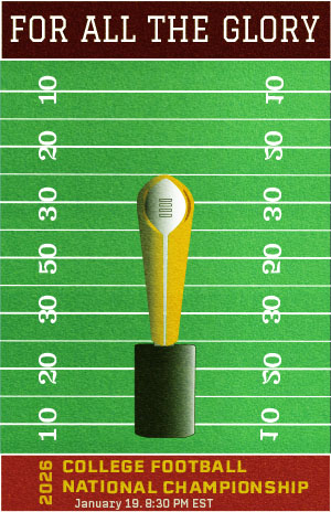
My goal with this poster was to create a rough, old school aesthetic that looked similar to a vintage sports poster. I kept it simple by putting the trophy at the forefront to communicate the significance of the match. used a high contrast color palette to make the visuals pop. To achieve the rough texture of the poster, I used a stock photo of field turf and used the “Soft Light” transparency mode. The most difficult part was adding the details on the trophy to make it look more like an actual object. Lots of tracing and retracing were done for this. As a designer, working with shapes and how to orient them better is something I can improve on. I could’ve added some more depth using the Draw Inside tool.
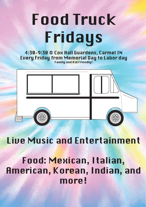
The Food Truck Friday event takes place every single Friday from Memorial Day to Labor Day. There is exciting live music at every event weekly, with exciting new food coming each week!
For this project, it was my goal to create a popping poster that was family-friendly for a weekly event: Food Truck Fridays at Cox Hall Gardens in Carmel, Indiana. I wanted the poster to match the atmosphere that the event would have. I wanted to make sure the event name stood out, but did not take too much away from the food truck design in the middle. Through my process, I sketched out a couple ideas with different color ways and this one fit the tone I wanted to portray the best. I looked at the type, choosing a bold letting that is still readable was my goal. I feel that the strongest part of my poster is the energy it brings, showing the colors, layout, and lettering all bring clarity in the event and what is going on during it.
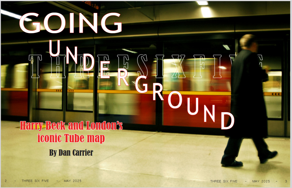
My main aim for this Harry Beck tube map spread was to let the subject matter lead the design by using Beck’s own design principles to tell his story. I think this approach was successful, as the geometric layout, color palette, and clean typography all work together to tell a story about design revolution.
Click image to see my full design!
The key takeaway from this project was to let content inform. By arranging text blocks with the same clarity and logic that made Beck’s map so great, I created a dialogue between his work and modern editorial design. I could have taken this further with more dynamic text layouts that truly mirrored his spatial innovations. This project taught me the balance between honoring historical design and meeting modern readability needs; a tension that actually made the final piece stronger and gave me a framework to use in future publication work.
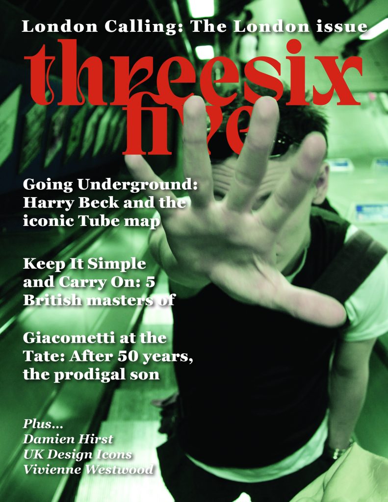
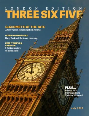
My primary goal for this project was to make my pages readable and visually cohesive while also still being interesting. To do this, I focused on maintaining a monochromatic color profile throughout most of the publication and tried to keep my fonts consistent. I also kept everything in a grid, so it stayed neat and orderly. To grab some visual interest I increased the font size and boldness in the headers. For the cover, I put all the text on the left side to balance out the bus on the right, and I made the “Three Six Five” logo big and bold to be eye catching. I also layered the logo to add some more visual interest. In the last pages of the Giacometti spread, I tried to arrange the images around the text so that when you finish reading the first page, the beginning of the second page isn’t so far off, while also balancing the images so that they look even across the pages. I feel like my goal of keeping things readable and cohesive was pretty well met and I am satisfied with how it turned out. I feel like I could probably have done more to make it more dynamic but I would work on that for the future. Throughout this process, the hardest part was working in an unfamiliar application – and also one that consistently kept crashing my computer. Aside from that, I’m happy with how everything turned out in the end, and I learned a lot from making this.
My goal was to create a visually engaging and informative magazine that highlights the impact of design history—especially through Harry Beck’s Tube map. I believe the final product achieves this, offering clear storytelling paired with strong visuals.
I used clean, modern fonts for readability and chose a muted color palette to give the magazine a timeless, professional feel. Images—especially of Beck’s map—were central to the layout, helping guide the reader through the narrative visual
This project gave me a deeper understanding of how thoughtful design decisions can enhance storytelling. One of my goals was to create a consistent visual language that tied the magazine together, and while I achieved that in many ways, I also ran into challenges that taught me valuable lessons.
A major success was the intentional use of red and cream tones throughout the magazine. These colors were inspired by the vintage train on the cover and helped establish a retro yet bold aesthetic that connected with the historical focus of the Harry Beck story. Carrying that color scheme across different pages gave the magazine a cohesive tone and subtly reinforced the subject matter without needing to say it outright.
In the map evolution section, I used colored lines that mirrored the actual Tube line colors found in Beck’s diagrams. That design choice wasn’t just decorative—it was meant to echo the visual structure and clarity that made Beck’s map so iconic. It helped visually tie the reader back to the concept of simplification and design efficiency, which was a core theme of the article.
However, not every design decision was successful. I struggled with margin consistency, which made some pages feel slightly off-balance. It’s a small detail that has a big impact on how professional a spread feels, and I now see the importance of double-checking these layout basics. Another area that didn’t meet my expectations was the silhouette of the blurry man on the cover. It was meant to add mystery and atmosphere, but the execution fell short—it looks more like a flaw than a design choice. Next time, I’ll refine my image editing and be more intentional with how effects like blur are used. Not to mention I mistakenly made the cover across an entire spread!
Overall, I learned that subtle details—like color matching, spacing, and visual references—make a big difference in the user experience. I also learned to critique my work more honestly and recognize when something isn’t working visually. In the future, I plan to push my design skills further by exploring more refined layout structures and becoming more detail-oriented with spacing and imagery.
Before starting my design process, I knew that I wanted to focus on the story about Antonio Giacometti for my main article and the album covers for my ASF. My goal was to make the magazine appear as an homage to design in all its forms, not just through my choice of images, but through my layouts and typography choices as well. I wanted each page/section to have its own design story while remaining connected to the magazine as a whole.
Starting with the cover, I chose the image of Big Ben because I liked how clearly you can see the tower’s intricate details. It echoed the elegance and beauty that I associated with London and wanted to convey through the magazine. That is why I also incorporated a PT serif font on the cover, which I also used as my main body copy text throughout my other spreads. My headings I kept in a sans serif font to maintain simplicity against the complex background. It was really rewarding to be able to apply the sandwiching effect that we learned in the Bub cover tutorial here.
For my ASF, I definitely struggled at first to figure out how I wanted the layout to look like. At first, I tried creating a design using music staff lines, but I struggled with making it aesthetically pleasing. It took me a good while of brainstorming to figure out what direction I wanted to go in. Finally, I was thinking about what associations to music I could make with my design and, thinking about the music that the bands of the album covers played, I thought of an electric guitar. I decided to make a design where I could use the guitar frets as a visual for the ranking of the album covers. With some careful browsing on Adobe Stock, I found an image I felt was perfect for the mood and proceeded with placing the album covers from there. I had to alter the body copy slightly to make sure it could all fit, but I ended up with a design that I am very proud of. The body copy typography I kept consistent with the rest of the magazine, but incorporated the Phosphate font for my display typography because its lines remind me of a music record.
In my opening spread, I wanted the image I chose to reflect the title of the article, “Edge of Madness.” I started with an image of Giacometti painting a sculpture, but ended up changing it to an image of Giacometti standing in his messy studio. It was the perfect opportunity to preview the article by including the first paragraph on the opening spread that specifically addresses how messy Giacometti’s studio was. I used an Adobe Handwriting font for my descriptive typography because its scrawled and loopy look made it feel more personal to the artist (and also a little more “mad”). I incorporated that same font into the sidebar heading on my second spread. Finally, I wanted to keep the same “black and white” feel on my opening and second spreads, so I kept the color design minimal and simple. I only included a little bit of yellow highlight to add some variation and emphasis where needed.
Overall, this project was very challenging, but incredibly rewarding. I am proud of how much I improved in being able to think of a design that I wanted to create and then physically producing that design. I am excited to continue exploring InDesign and developing my skills more in the future.
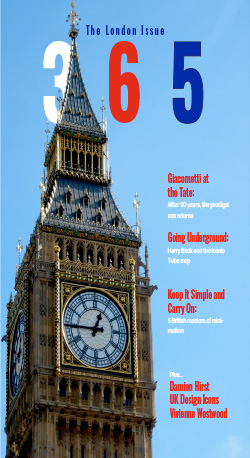
Making this magazine was an enjoyable experience and also taught me a lot about design, particularly how its not as easy as it seems. For this design, I wanted to make something that I think would represent the city of London well. I used a color scheme based off the London Underground transit map which was the focal story of my magazine. I primarily stuck with red, white, and blue but used other colors based on the iconic map. I wanted to keep the design fairly minimal and clean for the layouts by constraining how much was on each page to help with readibilty and hierarchy. I used Oswald for the headlines because it gives a bold look while not being too “loud” and Helvecta and Georgia for subtext and body text because of its minimal look and feel.
The overall expereince of making this was one worthwhile. I learned about the expressions of different types and how one works better at commnunicating your design than another. I learned about many stylistic techniques such as the “sandwiching” of Big Ben on the cover. These techniques are still imperfect so I have a long way to go until I become an expert at it. I wish I could’ve done more on the ASF. I had a really good sketch that didn’t translate to paper as I thought. I think I got too ambitious and wanted to do something beyond my skill level. I will learn to step back and set realistic goals next time so I don’t waste time headbanging over one certain sketch. I can also improve on my color usage, particularly in making it look more professional. I should’ve utilized more techniques in making them pop more so it looks more appealing to the eye.
I found this project quite challenging in a very rewarding way. I often felt exactly where I needed to be as far as my eye for design and technical understanding of InDesign and Photoshop. This meant that I felt perfectly equipped, but that there was no spot where I was fully comfortable with my abilities.
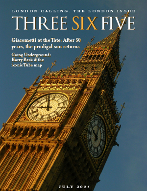
I used a minimalist design for my cover, highlighting the Tube merchandise I would later use for my sidebar. I did this to help strengthen the overall visual and thematic cohesiveness of my design. I used Time and National Geographic as inspirations for what a more minimalist magazine cover can be. My use of the thick frame in the bleed area is an obvious ripoff of those covers. The primary focus on one large subject or setpiece, a smaller focus on a simple brand identity, then some small text for the date and an explaination of the image is also a formula often seen on this type of cover.
I originally tried a cutout of Big Ben on a more abstract background for the cover page. I had two primary issues: 1) I was not fond of how my ideas looked when completed, and 2) creating image cutouts are my greatest weakness in this class so far. I get a bit better with each attempt, but I was simply not happy with my transparent Big Ben at the time. It’s a difficult shape to cut out and I’m still struggling with coins and bottles.
My opening spread is also minimalist, which is still a way to utilize my perceived current strengths. The bars with text over a Gaussian-blurred map of the London underground gives me an opportunity to showcase the map in a grand fashion without overcomplicating the design.
The minimalism also allowed me to work efficiently on the next spread. I used two images, one of Beck and one of the 1933 map, which framed the story well and allowed it to fill the available space almost perfectly without many subtle tweaks. The story is about the origins of the map, so I wanted the map someone can actually spend time looking at to be the 1933 draft. A full version of the modern map is easy for someone to find if they would like to look. Including the image of Beck also felt necessary.
My sidebar used the “Tube Gear” idea. Through the cover and a frame around a white background, I wanted to make the sidebar feel like an integral part of the story. I then used three items that allowed for puns and alliteration. I complimented that with a playful decorative type. I imagine this is a common kind of sidebar to see in ThreeSixFive Magazine.
I broke with minimalism for my ASF in order to challenge myself and distinguish it from the rest of my project. This was incredibly difficult. I still feel as if the spacing I gave each object and the size everything ended up being is deeply flawed. I worry that things may feel uncentered and non-rythmic, even if the proportions are technically very squared. I am, overall, still very proud of the design. Despite its flaws, it is the page that makes me surprised that I put it together as an amateur graphic designer.
My goals for my publication was to create something that felt cohesive as well as to properly choose text fonts and colors that aligned with the images being used and the stories being told. I wanted to create something that caused me to have to use some of the new skills that I have learned in this class so far. I do feel as though I was successful in completing these goals. I feel like the fonts that I picked were decent choices and they did not seem out of place. Outside of when I used black and white, the colors that I chose to use for the text matched certain colors in the images. I also used a couple of new skills that I learned. When choosing font colors, I used the eyedropper tool on the images. I utilized the rectangle tool on my ASF page and also used the eyedropper tool for the colors of each rectangle. For my spread, I went back to what we learned during our Will Cactus assignment. I used the quick selection tool and then adjusted the hue, saturation, and lightness properties to color everything outside of Alberto Giacometti.
For the cover of the magazine, I wanted it to look more like a touristy magazine. I chose the image that I chose as I feel like it is the type of image you typically see on a tourist/travel magazine. I wanted the font colors to not just be white and black, so I decided to pull colors from the image by using the eyedropper tool. When it came to the spread and I read the word “madness”, I thought it would be neat to utilize a color that I associate with the word “madness”. I originally thought of red, but went with blue as it is another color I associate with the word. I also just simply thought it was a fun way to play around with tools that I learned how to use in Photoshop and thought that the pop of color would stand out more than just the plain image. When it came to the two pages that incorporated the rest of the main story as well as the side bar, I wanted to keep it simple. I just put the text in a normal layout and used Times New Roman for the font. With the side bar, I did try to make it more interesting with the colors. Again, I used the eyedropper tool and used a color from each image in the text box. For the ASF, I once again did a simple layout, but I decided to add lots of color. I think that music is such a fun topic and I think lots of color helps to encapsulate that fun. I utilized the eyedropper tool here as well.
I learned that it is extremely important to be selective and intentional with the images that you choose. I found myself at certain times picking certain images because I liked them more. However, I learned that the image you like the best does not always fit the story or the text the best. During my original design, I was implementing way too many different fonts. I thought it would be fun to incorporate so many that I liked, but I found that it did not work for this specific project. It only made it look messy. This mistake taught me to better understand that it is better to use less when it comes to the number of fonts. I can definitely work to improve on making more interesting layouts. I feel as though most of my layouts are quite simple.
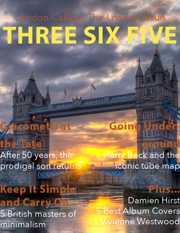
For my final project, I created a magazine spread for THREESIXFIVE: The London Issue, and it ended up being one of the most rewarding design experiences I’ve had. This project helped me understand how editorial design goes beyond just layout, and it’s really about storytelling, pacing, and guiding the reader through both visuals and text in a meaningful way.
One of the biggest things I learned was how to use alternative story forms to break up information and make it more engaging. For example, the album cover feature uses visual hierarchy and icons to let readers scan quickly, which added variety to the overall reading experience. I also gained a lot of insight into how important type choices are. I used bold, expressive fonts for headlines and paired them with clean serif text for readability, especially in the Giacometti feature, which needed to feel both artistic and serious.
Design-wise, I went with a muted, modern color palette inspired by London and museum spaces, to tie the art and cultural themes together. I used full-bleed images for impact and kept a consistent grid throughout to make sure everything felt cohesive. The cover is simple and type-driven, which I felt set the tone well for the rest of the issue.
Overall, this project really pushed me to think like a designer, not just about how things look, but how they function and communicate. It was a great way to apply everything we’ve been learning this semester, and I’m proud of how it all came together.