Categories
Uncategorized

Anthony’s Website

I enjoyed this project. It was frustrating at times but I enjoyed learning about all the small technical details. As far as the design goes, I didn’t know what color to make the background so I decided to use an image instead. I wanted it to be a scenic image and it is just in time for the holidays so this image I found was perfect. I wanted my type to standout against the background so I decided to go with plain black.

The easiest part of this project was definitely writing the CSS. The HTML was already pretty much pre-written so that was of course very simple to edit. However, the styling was very simple and straightforward.

The most difficult part by far was actually publishing the site. I published it from home so I had to access the IU vpn which was simple enough. However after that, using Cyberduck was a separate hassle in and of itself.

Overall the assignment was very interesting to do. I learned a useful skill that I can take with me. I was able to work on my problem solving skills. I also had a lot of fun.

Link: https://anthhowa.pages.iu.edu/J365/

Categories
R. Shultz Website

Rebekah’s website

https://reshultz.pages.iu.edu/j365/

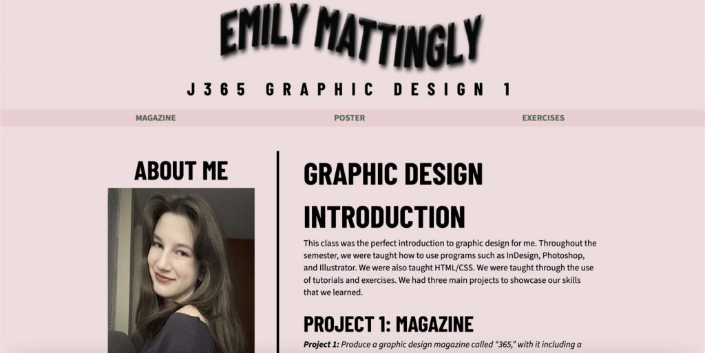
For my website, I chose a more pastel palette because I thought it looked nice together and represented the colors that I am more drawn to. I also chose a fun font for my name and the headers because I thought it would grab the reader’s eye and I liked how the font looked fun and not so rigid.

The most difficult part of the entire process was starting with HTML. Although I felt like I got the hang of the process towards the end, the beginning was rough and tedious. When creating a website, you have to build the foundation first. Luckily, we had some code already in thanks to Professor Layton, but I still found it difficult. The most frustrating part about coding is you can press one wrong symbol or letter or even not put a symbol down and your website could look very strange.

I am happy with how my website turned out because I think it looks cohesive with how the fonts and colors are paired together. I am also proud of myself because although I do not know much about coding, I really enjoyed myself throughout the process. I especially enjoyed CSS because you get to play around with the completed website and more of the design aspect.

Categories
Uncategorized

Emma’s Website

Before this project started I did not know anything about coding. Throughout the process of creating my website I have developed new skills and understanding of coding using HTML and CSS. This is one aspect of graphic design that I did not know I was going to learn about.

Starting with the background color I knew right away that I wanted to choose light pink because it is my favorite color and it shows my personality. Pink to me elicits feelings of joy and wonder. The other colors I chose were purple and dark pinks. These colors really complimented each other well. I wanted to choose dark colors to contrast the background for readability and ensure it is pleasing to the eye.

For fonts I wanted a serif body font. I think it is easy to read and I like the serif look for large groups of text. This font shows more of my analytical and practical side. For my display font, I chose a sans serif rounded font. I think that this font really shows my fun and bubbly personality. Together these fonts show my fun-loving personality and they work well together.

I wanted to add more touches of personality to my website. I decided to add my name at the bottom of the about me aside page in cursive, like a signature. The cursive represented handwriting, like in a note. I also decided to add a dot theme around the footer and nav. This added a fun touch to the website. To keep with the theme, I added one circle to each side of the ‘J365 Graphic Design.’ For the about me I added a double line around the aside portion. Lastly, I added text shadow to the name header. I really wanted to emphasize my name and have it be a focal point when people first view my website.

Link: file:///Users/emmabettencourt/Desktop/365%20WEBSITE/index.html#poster

Categories
C. Corriston Website

Claire’s Website

Link to my website: https://ccorrist.pages.iu.edu/

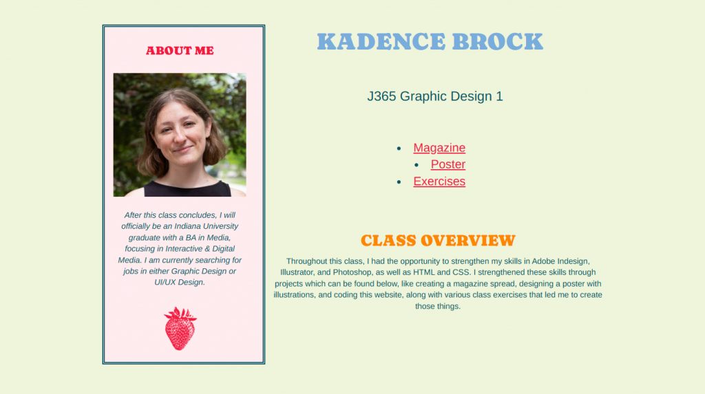
For my website, I decided to go with a fun and colorful tone. I wanted to use colors that looked good together but also had some variety. I also decided to go with a layout where my “about me” section is on the top left so that when people open my website, that is the first thing that they see. I liked how I had each of my projects in order so that someone can scroll and easily read about each one.

The part that I am most proud of is my use of different fonts and colors that represent myself. I also liked how I really understood the CSS aspect of building the project. As we were learning it, it made sense to me why some codes went where and what they did. So as I was experimenting with adding some unique aspects to my project, it was easy for me to play around and make design decisions since it came easy to me.

The hardest challenge that I faced was using html codes. I understood it when we were learning in class, but I had more trouble adding things than I did with CSS. It was hard to add things because I was either doing something wrong, or adding a code somewhere that it shouldn’t be. Overall, I really did enjoy learning about coding and playing around with all of the things I can do with it. I am happy with how my website turned out design wise and it is very user friendly. I want people to easily read and use my website to learn more about the different projects that I did throughout this class.

Categories
S. Harsh Uncategorized Website

Sydney’s Website

https://sydharsh.pages.iu.edu/

This has been my favorite project by far that we have done in this class. I really enjoyed messing around with the code to make the vision I had in my head come to life. The website opens with a photo of me, and me writing my first name. I chose to do this because I wanted the viewer to have a more personal experience with the website, and get to know me better. I have always been interested in videography, and I wanted this website to not only be a portfolio, but an experience. This was a big reason for adding any interactivity on it at all.

In the top left corner of the website, there is a menu. This menu opens up with each project, and allows the viewer to jump to any project they want to. I wanted to add this because I think it looks really clean, and it matched the vibe I was going for. I had a really hard time finding the code to make this possible, and when I finally did, it still was not working. I had to combine two pieces of Javascript to make the menu turn into an X while also opening up with the options. Although it took a lot of time I am really glad I spent the time on it because I think it looks really cool.

As you move down the page, I added each project with a number next to it, so the viewer would know what project it was. I made the numbers large because I wanted it to feel simplistic but dramatic. I think this effect was achieved specifically because I added a hover affect to the images and hid descriptions for each project until you hover over them. I put a lot of thought into this and I love how it turned out.

As for the About Me section, I wanted to keep the same clean, minimalistic vibe. I purposely left a lot of empty space about it so that when the user scrolls down, it is all they see. I personally enjoy when websites are like that, and wanted mine to have that affect.

My favorite part of this website is that I feel like when I look at it I can feel the intentionality and purpose put into each affect. I also love that from the moment you are on the page, it feels like a story. I love photography and videography for this reason, telling stories, and I am very proud to say I feel like I achieved that with this website as well. Overall this has been my best project and by far my favorite.

Categories
Uncategorized

Connor’s Website

For my final project in J365, I created a website that illustrates our four projects. It consists of the Front Page, Magazine, Infographic and Poster. I decided to make a simple website design that clearly displays all my work, and has links to see each one in more detail with a PDF.

I used a blue background with a font that reminds me of handwriting. I wanted it took look creative, and fit well with the design aspect of my website. Each Image is around the same size, and aligned on the left of the screen beside each text box. I also added a section on the bottom of the website that talks about myself, contact button via email and a photo of my face.

I have never coded before but enjoyed creating this website. I thought it was a very difficult and daunting task at first, but as time went on I got better at it and remembered the basics. I hope to get better with coding and create more projects like this in the future.

To view my website, click this link!https://ccadden.pages.iu.edu/J365/

Categories
R. Brown Website

Ryan’s Website

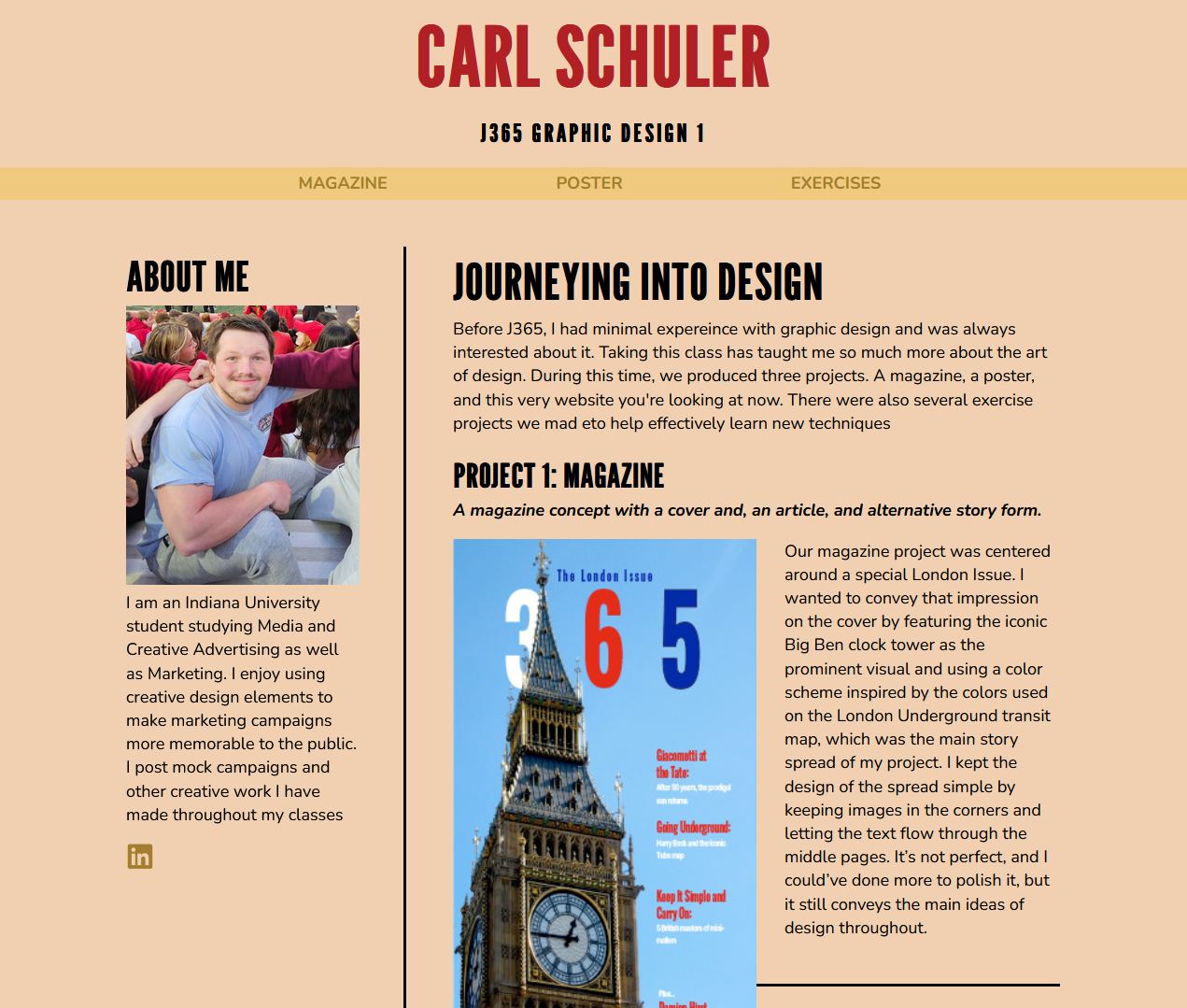
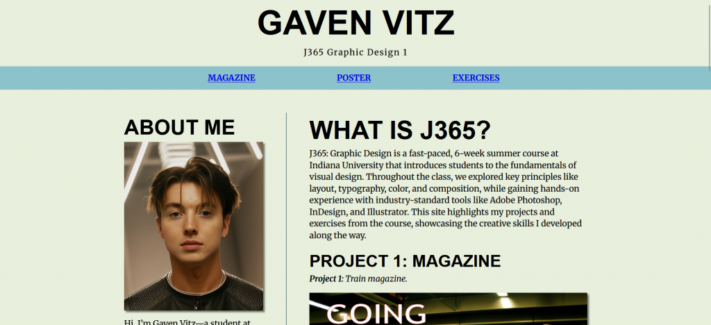
For the last project of 365 we were given the task of making our own website to showcase all of the previous project we did earlier in the year. The use of html and css were very new to me. We started with the html to input our text, pictures, and pdf into the website and then we used the css to design and style the website

I made a color scheme in photo shop to base my website off of. I chose to do a dark background with a lighter text and a blue header text. I also chose text that I felt went with the color scheme to make my website look as clean as possible.

I think the most difficult aspect of this project was the CSS and making sure everything was in the right place and when something isn’t and you keep trying ot make it go into the right place but you cant get it to work it gets really frustrating. The second thing that was really hard was downloading the vpn and making it so you actually had a working link for your website.

Overall, this was the most frustrating project we have done yet, but it did feel really good when I got it right. Looking back at a website with all of my work is pretty cool.

Link to website

Categories
L. Fitzgerald Website

Liam’s Website

For our last project we were asked to make a website about all of our projects throughout the semester. We started off using am html to add the text and images for our work. Then we went to the css to make the format and style of the website.

For the css I wanted the layout to look like all of my work throughout the semester. I wanted to keep my website simple because that is who I am. All of my projects throughout the semester have not been anything crazy so I did not want to change that. I used simple colors and simple text to make this possible.

I really enjoyed this class because I was able to see if I wanted to join the creative side of advertisement. I learned that I am not the best at making ads but am capable of coming up with an idea. Being able to use all the Adobe products will be very useful in my future.

Click link to go to website. https://liamfitz.pages.iu.edu/j365/

Categories
A. Heiser Website

Ashlyn’s Website

https://ashheise.pages.iu.edu/

Our last J365 project was to create our website, using information and PDFs from our other projects done in Graphic Design 1. We used sublime as our coding platform and used HTML and CSS to start coding our website. I learned the difference between HTML and CSS and how they vary but also go hand in hand in creating the visuals for the site. I started with the HTML code and started to upload my project pdfs, any information I wanted to add along with adding a little biography about myself. After adding the core information, CSS comes into play, making the website’s design come to life. 

I wanted my website to resemble what I like, and make it vibrant so that is how I chose the color scheme through Photoshop. I chose the black, green, and blue theme to go with a more vibrant approach, from there I chose what best font fit with the color scheme and the image that I chose for my portrait. From there I began adding in the formatting, such as padding, margins, alignment, and bordering that began to make my website become more structured and professional. 

 The most difficult aspect of this project was trying to keep track of my coding and what code went to which element on our site. Overall for me, this was our most difficult project as I had little knowledge about coding before starting, but throughout tye last few weeks I began to become more familiar with the concepts and believe I could use these skills later on to develop an elementary design. 

Categories
L. Conard Website

Lars’ Website

For the final project of 365, we constructed websites using HTML and CSS to display our work over the semester for this class. You can visit my website here! I have previous experience using HTML and CSS, so I wanted to challenge myself by creating subtle animations and different interactions on the page using JavaScript.

The website also changes elements when shrunk to the size of a mobile device. I wanted to explore further into how that may be achieved using CSS, without simply using percentage values for sizing on every element. Also the use of linking to anchors within the page was new for me, and seems to be useful on single long page designs.

Creating this website helped me look past the front end design I’m so used to working with, and rather think of ways to create interactions within the webpage. In refining my own portfolio, and working on general web development in the future, I’m happy to have built this confidence!