Going into this project, I had three main goals that I wanted to reach. My first goal was to create effective layouts that had a good balance within their designs. I wanted to focus on this because I have not had to make a magazine like this before, so I wanted to use this as an opportunity to get more experience and grow in this area. My second goal was to work on speaking with type in this project, since I haven’t had a lot of opportunity to play with type and use it to express ideas in past projects. Finally, as I worked on the project, I put more of my focus on creating a cohesive design for my magazine. I realized that I was struggling with this as I continued to work on the project, so I created this goal for myself so I would focus on it more.
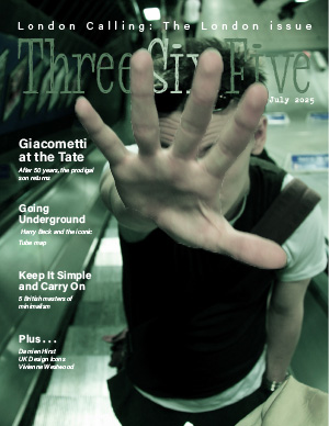
The first design choices I made involved the cover. Going into the magazine I knew that I wanted to focus on the “Five best albums” and the “Going Underground” stories; however, these two story topics don’t really have much in common so I spent a lot of time thinking about what cover image to use. I chose cover-17 because I thought it evoked the feelings of a punk rock musician, due to the way the man was dressed and posed. The image also was set in the Tube so I thought this cover image did a good job of combining the two articles I used. Once I chose my image I made a cutout of the hand to interact with the magazine title to create more visual interest in the image and pulled colors from the image to color the title as well.
My second design choices I made involved the typography I used for the ASF article. I spent some time messing with the typography of the ASF. I thought it would be cool to have the headline be in a square box to look like an album cover, but it was hard to get it to look right since I was using a three column layout on this page. Then I tried taking the typographic elements of the text on each album cover to make the headline. I decided that this was too busy and it took away from the images of album covers themselves, which was the focal point of the story. Instead, I decided to use the same font on the cover for all of my article headlines, to create a cohesiveness between each story. I then used this font to create large numbers next to the albums and made each number a color that came from the album to create visual interest and draw the reader’s eyes.
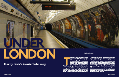
For “Going Underground”, I spent a lot of time deciding what images I should use for the story. Since the article was about Henry Beck and his map, as well as how Henry Beck is relatively unknown as a designer, I decided I wanted the opening image to be of Beck with “the diagram” to highlight his important role in the design of the Tube map. For the headline type, I decided to line up the word “underground” with the line of the map on the wall, and I made each letter of the word a different color from the different lines on the Tube to add a little color to the image and create an eyecatching headline. I then used the maps of the Tube within the article, placing them at the points of the story where they were specifically mentioned. I figured as a reader, I would finish reading about the map and then want to see it, especially since I am not from London. I also chose to use “Tube Gear” as my side bar, since it correlated with the content of the article better than the side bar about the posters..
When it comes to my creative process, I noticed that I have an easier time coming up with designs for individual articles or singular parts of a magazine, but I have a harder time making a cohesive design across the articles. I think this is because I usually use the articles and the images within them as inspiration for the design, colors, elements, etc. that I use. This meant that as I was working on this project a lot of the elements and colors varied from article to article, so I felt like I had a hard time creating something that felt cohesive across the whole project. As part of this I realized that a lot of the cohesiveness within the magazine comes from typographic consistency across the articles, so I am going to keep this in mind for future projects. I also had a hard time with getting my images sized correctly, especially when I was trying to adjust the resolution. I had to go back and fix some of the images multiple times because they didn’t look right or were too blurry, so this is something I want to continue to work on in the future. Finally, I also learned that when it comes to my design style, I tend to like simpler typographic choices when it comes to fonts. I liked using one font for all of the headlines within the magazine because it felt cleaner and more cohesive and I enjoyed using color, size, and the layout of the text to make each headline unique, despite using the same type.
For this magazine project, my goal was to create a clean and visually unified design that felt like a real publication. I wanted to highlight the artistic energy of London while maintaining clear readability across all six pages. I chose the Giacometti theme for the main article because I felt that his artistic style matched well with the architectural depth of my selected cover image. For the ASF page, I used a clean grid layout to showcase the five best album covers of all time, keeping typography minimal to let the visuals speak for themselves.One of the main challenges I faced was making the cover text readable on a busy photo background. I initially tried both white and black text, but neither stood out well enough against the brick wall. I considered using a semi-transparent black box behind the text, but in the end, I decided to go with a bold blue font color, which created a strong contrast while still matching the overall tone of the image. I think this solution balanced visibility and aesthetics in a cleaner way.
My goals for this presentation was to explore with design techniques based on the theme of the story. On my opening spread, I researched how to use the type on a path tool to create a visually stimulating piece that worked with the main image. It was really tricky to figure out, which caused the edges to not be perfect following the semicircle pattern of the tunnel. I felt accomplished since I was able to successfully use the tool in multiple parts of that spread. On my second spread, I wanted the three different train maps to feel like a train map in the process of reading. I created a path and focused on making sure it followed a reasonable path for the readers eyes to follow around the text. I feel like it works well, but the size of the left red line may end up being a bit distracting while reading.
I successfully stuck followed the three face maximum and connected my ASF to my main story with the Chalkduster font. I was especially careful on following my grid in the second spread. I tried to have each element line up perfectly to their grid lines, which made me specifically proud of the top left sign where the underground text perfectly covers the grid. I used the eyedropper tool on my cover and in my spreads to create unity, which I think helps keep a consistent and attractive theme. The grey background for the sidebar is the same color as the railroad in the opening spread image. Considering the story is focused on the development of the tube map, I thought the reader would be most interested in the evolution of the map. I wanted to design a an interesting way to see that evolution and I think it turned out to be very visually interesting.
Click image for full design!
I learned that it was incredibly helpful to plan ahead. There were a couple ideas I had for the opening spread and cover that would not have ended up successful in practice (at least in the way I tackled it on paper) and I am glad I caught that before I spent the time trying out the design. There were a couple ideas I had to bail on after giving them a crack, but it could’ve been much more. I also learned how to research my own techniques to incorporate into the design. The curved text on my opening spread could’ve been better. The time spent to get it where it ended was more than I expected, and I had to accept that it was not going to be perfect. So I think next time I should experiment with a concept a bit more before committing to it. I also noticed my text is a bit tight and uneven in places, and it may even cause my ASF to appear a bit bland. I like the idea I had, but maybe spending more time tweaking text and adding color to largely white pages could be more appealing.
My main goal that I had going into this project was to make something that I think looks good and is successful in sharing the stories/information and more importantly I wanted to enjoy the process of making it. I had a lot of fun working on this project. There were definitely parts of it that frustrated me. I have also learned that I am fairly indecisive because I went through about 6 different layout ideas for the main story and had to sleep on a lot of different ideas for how I wanted to approach the ASF. I think that I did a good job of meeting both of my goals for this project. Creating and trying out the different layout ideas that I had was a lot of fun and I think by allowing myself to try (and fail) so many times helped make a good final product.
The first thing that I did was pick out the fonts that I would use for the cover and rest of the magazine. I looked on Pinterest at other magazines and their font and layout choices to inform my decisions and figure out what works and what doesn’t. After I made the cover I used that to guide the typography throughout the rest of the magazine. When it came to adding color I decided to take colors from the main images I use. I did this because I think it helps in incorporating the images and the text together to create a harmonious look between the text and images.
My creative process consisted a lot of making a design and then putting down my laptop/pencil and thinking about it after thinking it through. I would come back and make changes or try another idea that I may have come up with. Something that was something that took a bit to get used to was the centerfold. I’ve done a lot of yearbook design so being able to have elements so close to the centerfold was very new to me and a mental barrier that took me a while to overcome. At first I struggled to calibrate to the scaling of things on the page I would make something, but then upon looking back it would be too big or small on the page. I think in the future I want to try and incorporate more white space and different ways of placing images into the design.
This post will explain my main goals, key design decisions, and an analysis of my creative process.
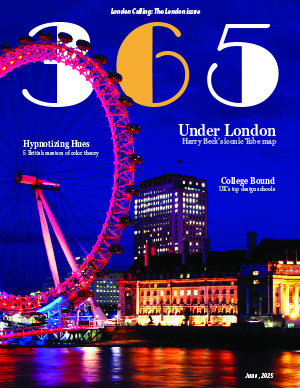
First, I wanted to create a magazine for young designers–a light, alternative, and nuanced set of stories that balanced history with design news and skill advancement/acquisition. Hence, I designed a cover with teasers that: offered a historical perspective of the London Tube map, the best design schools in the United Kingdom, and a review of color theory. This publication was, of course, for young people in the United Kingdom, but I did not want it to feel like a tabloid, which was quite difficult to avoid. The colors, typography, and photos all reflected a slightly “grungy” but still lively aesthetic that prioritized deep thought and critical thinking while holding Millennials’ and Generation Z’s attention. Simply put, this magazine was inspired by the news outlets and magazines that I use daily, but it also had to heavily incorporate and welcome (art) history and artists of all kinds, which are not the topics of most of my favorite sources. My favorite online magazines and news sources are: The New York Times, Forbes, Sentient Media, We Animals, The Guardian, National Geographic, and the BBC Science Focus Magazine; after reviewing their style choices, favorite fonts, and notable teasers, I adjusted my own cover to make it look more professional and show continuity and stylistic flow. I also looked online, specifically using image searches for classic publications like TIME, Vogue, and National Geographic for inspiration as well, both for my spreads and the cover. Thus, while I wanted to establish my own visual identity, I also used outside sources to help create a professional magazine, rather than something like a tabloid or otherwise weak presentation. I do believe that I achieved my goal to create a serious, yet aesthetically pleasing magazine, while focusing on history, design, and the youth.
Furthermore, I spent most of my time adjusting my typography, images, and colors. The most difficult part of this project was pairing images and colors, as well as establishing an identity with my fonts. Beginning with typography, I chose to use Broadway, Georgia Pro, and Avenir Next as my three font families, but I used P22 Underground for my headline. I chose Broadway after much contemplation. While Broadway was initially created in 1927 as an Art Deco typeface and usually reminds us of the 20s and 30s, to me, it invoked a feeling of older art forms–dance, music, and drama–that were “wild” for their time. It is a font family of history and innovation of art forms, which deeply resonated with the purposes of my own publication. In addition, I chose to use Georgia Pro, as I read that The New York Times used to use Times New Roman but switched to Georgia; I love The New York Times, and because Adobe InDesign comes with 20 stylistic variations of Georgia Pro, I decided to use Georgia Pro, as it looks a lot like Georgia and has a wide range of styles. Georgia Pro acted as my main Serif font, and I used it in my body text, deck, and author’s name, as well as in my teasers. I chose Avenir Next, as our professor used Avenir in one of our assignments, and I wanted to try it too! However, I only had access to font families such as Avenir Next and Avenir New World. I wanted a Sans Serif for my captions; I also used the Sans Serif in my sidebar and my ASF page, as well as on my cover. I needed a font family that was suitable for my captions but was readable (for the slightly longer paragraphs, like the short paragraph in my sidebar). Next, I used P22 Underground. This font has a story. P22 Underground was created by Paul Hunt in 1997 for the P22 Type Foundry and is an adapted and publicly available version of Johnson, designed by Edward Johnson in 1916 for the Underground Group. Thus, this font was used by the London Underground! I initially used a font family called Omnium, as it was rounded and reminded me of the long tube lights illuminating the insides of buses and along railway passages. However, once I found the font used by the London Underground, I knew that I had to use an adaptation of this font for my opening spread. Moving forward, I must describe my image choices. I chose the image of the London Eye for my cover, because I thought that I could use the “sandwich” effect with it, just as the class did with the Lil Bub cover. I also loved the colors in this cover, and I loved that the colors (blue and orange) were compliments on the color wheel. However, I experienced difficulties with the colors, as CMYK and RGB versions of the photo looked completely different. These issues will be addressed in the next section, but shortly put, my color scheme changed to include yellow-orange and blue-violet. Virtually every photo had to have at least one of these colors, once I made this choice. The image you see in my thumbnail has yellow-orange in it (I used the Eyedropper tool to pull this color from my cover); the text box is a tinted version of one of the two blue-violet colors that I pulled from my cover image (using the Color Theme Tool). Notably, I also used the Golden Ratio and had to crop my image to show the tracks running toward my body text! Thus, my photo took approximately 62% of the space, and it was cropped accordingly, while still abiding by the Rule of Thirds! I continued this pattern and applied the Golden Ratio to the Sidebar on the left side of my second spread and to the main image on the right side of my second spread. The main image (a train) also contained yellow-orange, and I had to swap out the image three times before finding the best one! Images of the maps and of Harry Beck were added to provide historical elements, as I wanted to add visual references within the story, though these elements did not abide by my color scheme (they were thus used as smaller images and did not have as much attention drawn to them). With respect to the sidebar (I chose Poster Parade), I used a tinted version of the one of my color swatches from my cover. I chose to use six images in my sidebar and displayed them chronologically. I did not use all eight posters in the sidebar, as I ran out of room, but I did choose to remove the two posters whose publication/creation dates were duplicates. The posters used also tended to have a blue-violet, blue, orange, or yellow-orange element in them. Lastly, my ASF page was designed to reflect an informative but playful aesthetic. The images were all given strokes from the cover’s color swatch (or using the Eyedropper tool), but I tinted the colors to turn them into pastels and add to the playful effect (I also rounded the edges of each box around the image and around the ASF itself to add to this effect). Thus, this process was long, but the complementary color scheme, three font family rule, and rule of thirds, were carried throughout the magazine, adding continuity of style and consistency of effect. As most of my issues revolved around color, this topic is addressed in the next section.
In this last text block, I will review my mistakes and issues. I had many. First, I struggled with color. The image that I chose for my cover looked very different in Photoshop, and when I added it in InDesign, it changed from an orange and blue color scheme to an orange-yellow and blue-violet scheme. I knew that I had to use the CMYK color model for print projects, but I wanted to preserve the blue and orange complementary color scheme seen in the RBG version of the image. My original plan involved crafting the cover in a separate file and importing the cover as a PNG. Then, I would import the cover without impacting the spreads, and ASF, which would both use CMYK color settings. The final version would use the RBG model for the cover (as a PNG) but still technically be using CMYK colors everywhere else, abiding by the printing rules. However, after doing more research as to how the CMYK and RBG models work, I realized that CMYK model is better for print projects and is a subtractive model, while RBG model uses additive light and needs a screen. Because I wanted to maintain consistency, I used the Transparency Blend Space to change the settings back–from RGB to CMYK. Because of this change, I spent Saturday altering my entire color scheme, swapping images out, and redesigning my headline for my opening spread. The issue came when I went back to Photoshop to create my thumbnail. The file using the CMYK model was dull and unimpressive as a thumbnail, so I used RBG color model settings, just as our video tutorial suggested. However, my project thumbnail looks different from the InDesign file and PDF. Because of this inconsistency, in the poster project, I plan to either use the RBG model (as we used this model when making thumbnails) or only use colors that are “CMYK-safe” (and are less affected by conversions between models). For the former option, I have read that the file should be saved as a transparent PNG for printing, as the printer uses RIP for CMYK color conversion. For the latter option, it seems that some colors are better preserved during conversion than others, as the available colors are more limited in CMYK than RGB color models. I have learned much. Because I am new to this type of project, I assumed that my only option was to use CMYK color settings to maintain consistency, but I now see that I just need to do a little bit more research, as the answer to my problems are not black and white, and I can alter my settings to fit my needs. I have a better plan to illustrate my poster now! Lastly, I learned so much from this project. I learned how tedious this process is. I learned that I must create a contingency plan. I learned that I must take the process in stride; as soon as Week Two began, I started working on the first project instead of waiting. Yet, I had not acquired a full skill set to tackle the project, so I had to redo a lot of my work later on, resulting in over 30 hours of work being needed. As I saw issues with typography, looked at other magazine spreads and covers, perused past students’ work, and designed my magazine’s first six pages, I found out that I needed to work more slowly. I had to work and revise, instead of race forward. I also learned that I needed to accept that a first draft might not be good enough. I became so attached to my work that I was hesitant to change the color scheme from orange and blue to yellow-orange and blue-violet and to move from the Omnium to P22 Underground font family. I was afraid to alter my work. In the next project, I intend to embrace the struggle, work fewer hours, and make rough drafts. I will embrace the tedious process of sketching and resketching, and I will look to work slowly, as the tutorials are given, instead of working too far ahead, before I am ready. I am so excited for the next project, as I become a better artist and designer!
For our third project in J365, we were tasked with creating a poster from scratch surrounding a topic of our choice so long as it fit into the basic guidelines of the assignment. I decided to create a poster for the show Invincible. I had noticed a lack of posters around the show that weren’t simply still shots from episodes, so I saw an opportunity to create an original concept for a poster surrounding the show. This project created an opportunity for me to learn, adapt, and utilize the tools within Adobe Illustrator and really challenge my creativity, originality, and skill set.
When beginning, I had come up with a varying amount of concepts. I knew I wanted to surround the project around Invincible because I had started watching the show and really appreciated the story but also the origin. Invincible is an animated version of it’s comic counterpart, so I wanted to draw inspiration from it’s beginnings for this poster. Many of the concepts I had initially came up with looked as if they were comic book covers, and I really wanted to stick with that concept but also create something that was typographically focused with illustrative elements. I had decided colorful silhouette design.
For the typographic elements, my decision-making skills were put to the test. I searched through adobe fonts, wanting to find a balance between the typography used within the show, the comics, but also original. In the end, I decided on Abolition which is a font I found using Adobe Fonts. I felt that the Abolition font is bold, but readable while leaving an impact. For the main headline “INVINCIBLE” I distorted the text using the distort effect. It took many tries to fit within the yellow box I had placed behind it as a guideline
My process for creating the silhouette was frustrating, but the effort I put into the design taught me how to really simplify and work with a mouse and the pen tool within Adobe Illustrator. I first found some reference photos, looking at both the character design of Invincible himself, but also side-profile portraits. Using those reference photos, I used the program Procreate to create a sketch of what the final silhouette came to be. After the sketch was finished, I imported it into Adobe Illustrator, and this is where the challenge began. Before this project, as well as the in-class practice, I had no prior experience with Illustrator, let alone the pen tool. But, after quite a few tries, I got the exact outline that I had envisioned. I adjusted quite a few lines, curves, and overall composition within Illustrator in order to create a visually appealing graphic. Initially I only planned one centered silhouette. But, I had experimented with scaling and copying and decided that I wanted to fill more space and create a directional force that followed the typography, which led to the final 3 silhouettes being included.
The colors throughout this poster were very intentional. Each silhouette is themed around the variants of Invincible featured in season 3, with some creative liberties being taken on my end. I know that I wanted his original suit of yellow and blue to be a driving force when it came to the overall color theme of the poster because it is a recognizable element. This lead to the choice in background colors following that theme. The text border is based around the largest silhouette of blue and yellow. The 2nd silhouette is based around the suit that he is depicted in during season 3, I felt that this was important to include because of the recent season wrapping up around when I began composing this poster. The final silhouette, straying away from the dominating blue, is meant to be his “omni-man variant” from season 3. I thought that the red and white would really create a “pop” in the poster, and give the eyes a break from the blue, yellow, and black colors. The order of the silhouette colors are also intentional, representing the change and fear that Invincible faces throughout the series. I decided on black for most of the typography to contrast well with the vibrant colors around the poster, with a yellow “Streaming Now” in order to grab the viewer’s attention as to what is being advertised.
Overall, this project really helped me hone my skills within a new program that I now will be using for most, if not all, my personal projects outside of class. The pen tool, though frustrating at times, was rewarding to become well-acquainted with and I feel far more confident in the techniques required when using the pen tool. Implementing color theory, creative typography, original graphics and an overall appealing composition was challenging, but one of the most personally rewarding projects that I have done for this class.
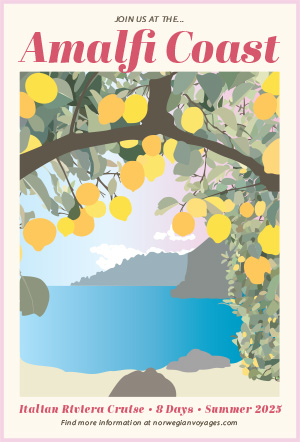
For our third project in J365, we had a lot of flexibility and freedom! We were directed to create a poster about any topic of our choice, as long as the design elements were original and it was advertising a product, service, or event. I enjoyed this assignment, as I was able to design something that excited me! Thus, I found myself choosing to spend hours working on it over my other homework because I was passionate about the topic and wanted to see the finished result.
For my poster project, I chose to create an advertisement for an Italian cruise along the Amalfi Coast. I recently found out that I’m studying abroad in Florence this fall, so Italy has been on my mind nonstop. I’ve also been seeing photos and videos of how beautiful the Italian coast is, so I wanted to recreate it myself. When choosing a reference photo, my two requirements were something with lemons and water. I chose this picture because I liked the difference between the foreground and background.
Originally, I didn’t realize how tedious the process of drawing out every single leaf on the tree would be. This alone took 3 days and I spent 90% of my time on this project with making the leaves. However, I stuck with my idea because I wanted to challenge myself; I knew the harder it was in the moment, the more proud I’d be once it was finished.
This poster was made entirely on Adobe Illustrator with the pen tool. I wanted the style to mirror my freshman year dorm wall art (posters with 2d art in the middle and a light-color border around it, featuring text on the top and bottom). My goal was for this poster to double as a real advertisement, as well as something that a teen girl would think is cute enough to hang up in her room.
The two biggest lessons I learned with this design was that making multiple layers is crucial, and you can’t let yourself become lazy. When I started the poster, I made a few layers of the bigger pieces (sky, rocks, water, sand, etc.). However, I chose to keep all of the leaves in one layer, and although it worked out in the end, I would’ve been much more efficient if I separated them into a few layers. Especially towards the end of the process, every time I made a new leaf, I had to hold my “send to back” keys for at least a minute until I found the perfect overlap position. My second lesson was that you can’t let yourself get lazy! In the beginning, I made every leaf its own shape and unique color. By the end, I desperately wanted to copy a clump of leaves I already made and paste them into the new area. However, this would be obvious to the poster viewers and would decrease the quality of the artwork. When I did duplicate a few leaves to save time, I made sure to change the color and shape so they weren’t identical.
When I finished the artwork portion, I realized it looked bland and faded. The italy I’m used to seeing is bright and colorful, but my poster didn’t reflect it. This is why I went back and changed the light blue sky to a pink gradient sunset. Additionally, I added a more saturated blue gradient to the water and made the lemons three bright shades to add texture, layers, and color variance. Next, I added the text. I searched for a font that screamed “Italy” and “vacation” all at once. I ended up choosing Abril Fatface because it was bold, fun, and quite frankly, reminded me of gelato. For the bottom text, I used the same font style for the trip information, and added a sans serif font at the bottom with the link to Norwegian Cruise Lines’ website. I thought adding a call for action would help make the poster seem more purposeful and real. Lastly, I added a pink border to match the hues of the sunset.
Overall, this was a fascinating project! My reason for taking J365 was to become comfortable with Illustrator (specifically the pen tool), and I feel that through these past few weeks, I went from hating Illustrator to loving it! I never felt like a true graphic designer because I always used at least one pre-made element, so it felt very rewarding to know I created this poster from start to finish. I’m excited to keep designing artwork in similar styles, and to show off my first piece of real graphic design!
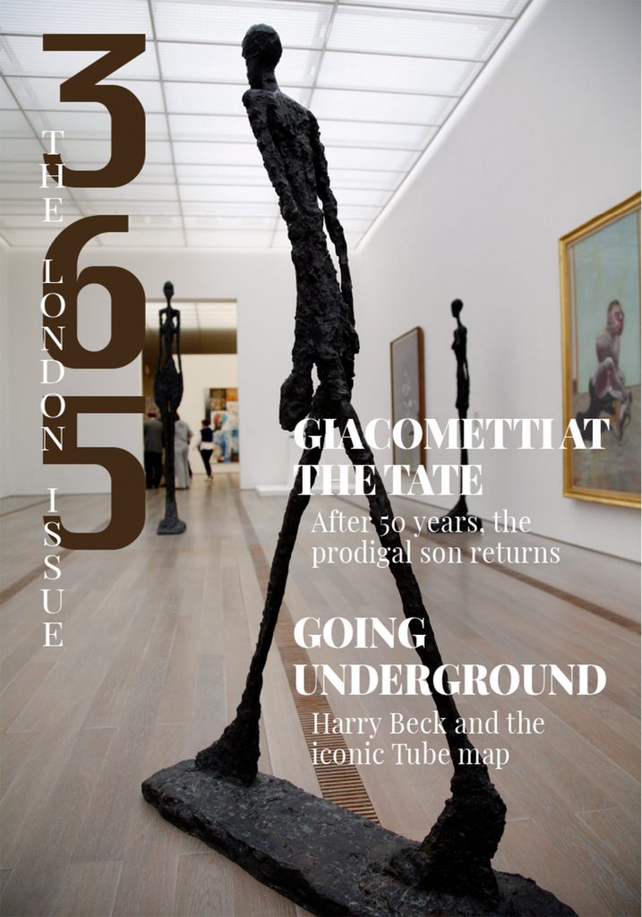
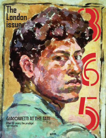
Obviously my first step in the process of creating this project was choosing which stories I would use. As an artist I was immediately drawn to the Giacometti article. After seeing the pictures available I felt it had more visually interesting potential.
Not only that but I was struggling to choose a cover picture. I wasn’t drawn to any of the ones given in the actual project download and looking for one sounded slightly overwhelming so I thought it would be nice to choose one that matched the article. I really liked the bright colors of the self portrait and saw potential for a good layering effect with the name of the magazine.
I chose the opening spread because it gave plenty of space for the type and it matched the “edge of madness” title in the sense that the sculptures shown were kind of spooky. However I of course needed to include his studio for the story so I made that the lead image on the second page. The other pictures were largely picked to fit in the cluster and make the text fit properly. My main regret with them is the captions. I originally had the captions separate and inside each picture but that was hard to read and very ugly so I moved them all to one. However I should have spent more time trying to make it work. The color is a bit hard to read against the color varied background.
As for the type, I didn’t think too hard about the body copy, just chose a serif font that was simple and dependable. For the captions and sidebar copy I chose a modern looking sans serif. For the magazine’s heading type I chose an art deco inspired font as I felt it was a strong look for a graphic design magazine. For the article heading I looked through adobe fonts to find an unhinged font. I liked Motion OT because it had a similar clumpy yet slender texture as the sculptures. The green for the fonts came from the strong green color in his self portrait to strengthen the connection and bring a bright color to a story with darker images. I feel the high saturation added to the madness feeling.
I went back and forth way more on the alternative story form. I had ideas for both but I didn’t love either. I started with the labels cause I thought it would be easier but it was so ugly so I started over with my idea for the icons. I arranged them on the page and then it was suggested to me to make more separation between the icons as they were bleeding together. I know we were told not to make it too boxy but it really did need sections. To try and combat the sterile feeling of boxes I tried to give it a patchwork quilt feeling. I feel this brought it to life some in a kind of quirky way. Originally I was trying to use the colors from the cover but upon going into office hours I was told this was unnecessary. Instead I used the colors from the icons themselves. I ended up cutting out the lamps to better fit my page’s structure.
Our second project for Graphic Design I was building a magazine spread. This one challenged me significantly more than our first project as it had more moving parts. As a part of this project, I used new tools in InDesign, such as the type on a path tool, and was able to practice layering images to create a more impactful design. I felt this project challenged me to consciously think about my design choices and overall create better designs.
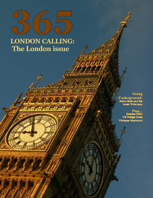
I wanted to keep my cover relatively simple. I chose the image of Big Ben at night because it had a wide variety of color but was easy to place text on. I used the eyedrop tool to pull colors from the photo and use them for the text. I also used photoshop to cut out Big Ben and then layered it so it was coming out in front of the letters. For my typography I chose to use Benton Sans Extra Condensed for both my title plate and my titles for my previews. It is a clean sans serif font that helped pull the design together and make it look very cohesive. For the decks, I used Didot which I then used again in my alternative story form, this font felt elegant but simple.
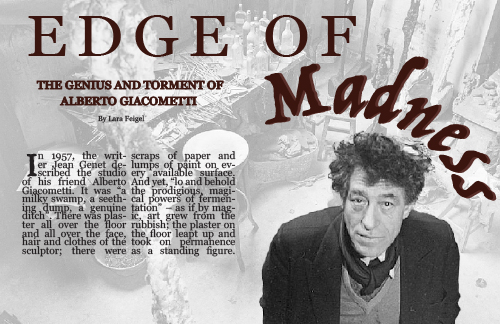
For my project I chose to create my opening spread over Albert Giacometti. For the opening spread, I chose the image of him in his studio as I felt that it embodied the story and expressed the chaos that surrounded Giacometti. To make it work well for my spread, I cut out Giacometti and layered him so that he would remain in full color as I increased the opacity of the surrounding image. I also chose to use Trattatello as my font for the word madness and then in the headline in the sidebar on the second spread to build that sense of connection between the first and second page. I felt this font mimicked the length and of Giacometti’s sculptures but also felt like a font that stereotypically associated with insanity and chaos. The rest of the typography for both the opening and second spread was Georgia to make the Trattatello stand out more. I also used the eyedrop tool to pull a red from one of his paintings to use as the color of my typography which helped to create a connection between the pages.
For my alternative story form, I used the six icons of British design and created circles that I imported the images into. This gave my design a sense of organization and looked clean but felt more creative than using squares or a more stereotypical shape. The boxes that I used for the list numbers helped them stand out more and created a sense of unity throughout the design.
Overall, this project challenged me both creatively and as a graphic designer. I was able to continue practice using InDesign which helped me get significantly more comfortable with the program and the commands. The choices I made were very intentional and required a significant amount of thought and time. I am happy with the way that my project turned out and the way it looked when I printed it out.