Categories
I. Pollard Magazine Uncategorized

Magazine

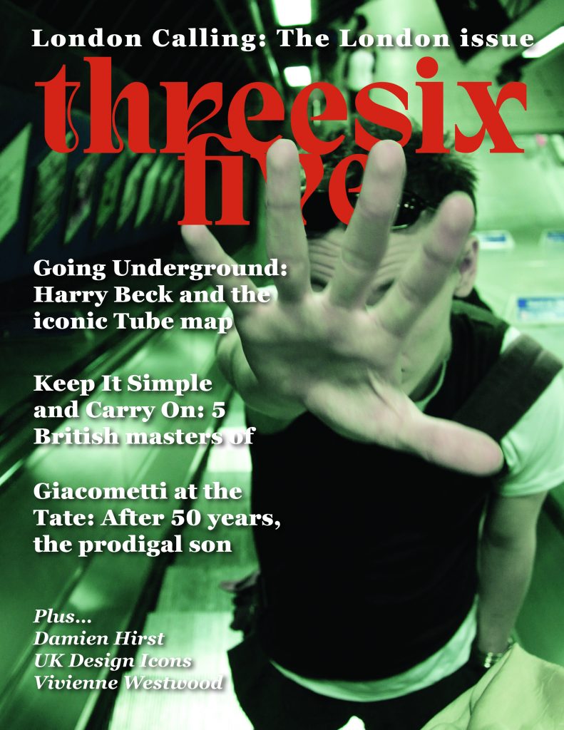
In this magazine, I tried to capture the artwork of the famous sculptor, Alberto Giacometti. I tried to keep the color scheme and layout to a minimalistic design, and the colors represent the clay that was used in his artworks. There are lots of browns in this design, as I thought that they would go hand in hand with each other. I tried keeping it close to a representation of an art museum’s feel that is sleek and minimalistic, letting the artwork speak for itself. I like the idea of starting the article off with “Edge of Madness” really capturing the state Giacometti was in when creating his art pieces.

As someone who also has a creative art background, I think it is important to highlight how a lot of artist spend so much time on their pieces that it starts driving them mad. Then, for the second story of the article, I wanted to showcase his paintings and drawings at the Tate in London. Seeing his earlier artwork, you can tell his designs have changed because of the madness that was driving him. I think that it is important to note that the artist themselves are their worst critics and the feelings of creating an art piece are seen through their artworks.

I ended up trying to capture and highlight Giacometti himself. I think that it is important to know the artist’s true intentions before making assumptions on the “why” and “how” when it comes to an art piece. Art is beautiful, and art is interpreted in many different forms. I took what I learned in my art class and tied it back to the magazine to encapsulate the meaning of Giacometti’s work.

Categories
I. Pollard Poster Uncategorized

Poster

I took my own spin on the project, and I made a poster capturing a country. The event itself is coming to that country to explore and enjoy what it has to offer. The poster design I chose was a poster that I would hang on my wall. It has the Philippine sun on the front with a woven texture to capture the country’s known design of wicker and threaded items. I used greens and light sandy browns to capture the lush greenery found in the Philippines with the typography “Mubhay” which also means “Welcome” in Tagalog, the native language of the Philippines.

I learned a lot from this project, and it took a lot of layers and redesign to get it to where I like it. I am not particularly proud of this poster and wish it could be better, but that’s because I designed it. I tried taking various elements from other Filipino event posters and tying them to my own work and design. I drew a lot of things on the illustration poster and used various brushes to create something that matches the overall theme.

Categories
I. Pollard Uncategorized Website

Website Design

Here is a closer look at the website that I designed. I think that it took longer than expected but that is with a lot of other projects.

Overall, I think that the designed and color scheme I used really represents who I am, I used my favorite colors of orange, blues, and greys. Coding the website was not the hard part for me but getting my wifi to work. I really tried my hardest to come up with a sleek and minimal design that also portrays who I am.

This is something that I was proud of doing. I’ve coded before but I always hated it, but for some reason, this was actually really fun to do.

Categories
K. Brock Poster Uncategorized

Solar Power

My goal was to create a vibrant, summer-inspired poster that captured the energy and freedom of Lorde’s “Solar Power” album through warm colors, balanced composition, and authentic connection to the music’s themes. I believe the final product was successful in terms of these objectives. The yellow and blue color palette effectively conveys summer vibes, while the central figure with raised arms creates the sense of celebration and liberation I was aiming for. The typography integrates naturally without overwhelming the design.

I started with sketches exploring different compositions before settling on the figure-centered approach. The biggest challenge was achieving the right balance between the text and visual elements. Creating depth in the flat, paper-cut style was also difficult.

The cohesive color story is my strongest achievement. The warm yellows and cool blues work together to create a calming feel, while the layered composition creates unity between all elements.

I need to develop stronger typography skills, particularly in creating more sophisticated hierarchies and text-image integration. This project taught me how color and composition can create emotional impact while balancing artistic vision with clear communication.

Categories
C. Schuler Poster Uncategorized

Football Poster

For this project, I made a poster about next years upcoming college football championship

View the full image

My goal with this poster was to create a rough, old school aesthetic that looked similar to a vintage sports poster. I kept it simple by putting the trophy at the forefront to communicate the significance of the match. used a high contrast color palette to make the visuals pop. To achieve the rough texture of the poster, I used a stock photo of field turf and used the “Soft Light” transparency mode. The most difficult part was adding the details on the trophy to make it look more like an actual object. Lots of tracing and retracing were done for this. As a designer, working with shapes and how to orient them better is something I can improve on. I could’ve added some more depth using the Draw Inside tool.

Categories
S. Fleischer Uncategorized

Food Truck Friday

The Food Truck Friday event takes place every single Friday from Memorial Day to Labor Day. There is exciting live music at every event weekly, with exciting new food coming each week!

For this project, it was my goal to create a popping poster that was family-friendly for a weekly event: Food Truck Fridays at Cox Hall Gardens in Carmel, Indiana. I wanted the poster to match the atmosphere that the event would have. I wanted to make sure the event name stood out, but did not take too much away from the food truck design in the middle. Through my process, I sketched out a couple ideas with different color ways and this one fit the tone I wanted to portray the best. I looked at the type, choosing a bold letting that is still readable was my goal. I feel that the strongest part of my poster is the energy it brings, showing the colors, layout, and lettering all bring clarity in the event and what is going on during it.

Categories
K. Brock Magazine Uncategorized

My mag!

My main aim for this Harry Beck tube map spread was to let the subject matter lead the design by using Beck’s own design principles to tell his story. I think this approach was successful, as the geometric layout, color palette, and clean typography all work together to tell a story about design revolution.

365 Magazine cover with hand blocking text
Click image to see my full design!

The key takeaway from this project was to let content inform. By arranging text blocks with the same clarity and logic that made Beck’s map so great, I created a dialogue between his work and modern editorial design. I could have taken this further with more dynamic text layouts that truly mirrored his spatial innovations. This project taught me the balance between honoring historical design and meeting modern readability needs; a tension that actually made the final piece stronger and gave me a framework to use in future publication work.