This was a lot of fun to make. It gave me a chance to show off some of the work I dine while gaining knowledge in web design. I wanted to keep the background colors softer for a more welcoming vibe when people visit so I settled on a sandy color scheme for the background. The only thing I wish was that my 3D headliner worked properly so I could show that but other than that, I think it turned out well for how awful of a coder I usually am. I hope to keep this web page handy for my future career as this would be a good spot to upload work for a portfolio.
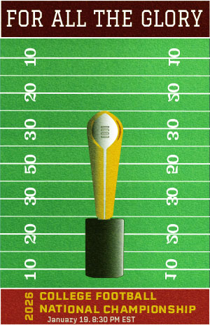
My goal with this poster was to create a rough, old school aesthetic that looked similar to a vintage sports poster. I kept it simple by putting the trophy at the forefront to communicate the significance of the match. used a high contrast color palette to make the visuals pop. To achieve the rough texture of the poster, I used a stock photo of field turf and used the “Soft Light” transparency mode. The most difficult part was adding the details on the trophy to make it look more like an actual object. Lots of tracing and retracing were done for this. As a designer, working with shapes and how to orient them better is something I can improve on. I could’ve added some more depth using the Draw Inside tool.
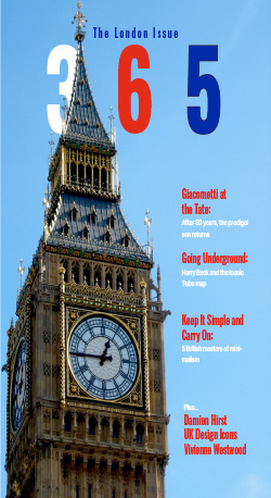
Making this magazine was an enjoyable experience and also taught me a lot about design, particularly how its not as easy as it seems. For this design, I wanted to make something that I think would represent the city of London well. I used a color scheme based off the London Underground transit map which was the focal story of my magazine. I primarily stuck with red, white, and blue but used other colors based on the iconic map. I wanted to keep the design fairly minimal and clean for the layouts by constraining how much was on each page to help with readibilty and hierarchy. I used Oswald for the headlines because it gives a bold look while not being too “loud” and Helvecta and Georgia for subtext and body text because of its minimal look and feel.
The overall expereince of making this was one worthwhile. I learned about the expressions of different types and how one works better at commnunicating your design than another. I learned about many stylistic techniques such as the “sandwiching” of Big Ben on the cover. These techniques are still imperfect so I have a long way to go until I become an expert at it. I wish I could’ve done more on the ASF. I had a really good sketch that didn’t translate to paper as I thought. I think I got too ambitious and wanted to do something beyond my skill level. I will learn to step back and set realistic goals next time so I don’t waste time headbanging over one certain sketch. I can also improve on my color usage, particularly in making it look more professional. I should’ve utilized more techniques in making them pop more so it looks more appealing to the eye.