Our second project for Graphic Design I was building a magazine spread. This one challenged me significantly more than our first project as it had more moving parts. As a part of this project, I used new tools in InDesign, such as the type on a path tool, and was able to practice layering images to create a more impactful design. I felt this project challenged me to consciously think about my design choices and overall create better designs.
I wanted to keep my cover relatively simple. I chose the image of Big Ben at night because it had a wide variety of color but was easy to place text on. I used the eyedrop tool to pull colors from the photo and use them for the text. I also used photoshop to cut out Big Ben and then layered it so it was coming out in front of the letters. For my typography I chose to use Benton Sans Extra Condensed for both my title plate and my titles for my previews. It is a clean sans serif font that helped pull the design together and make it look very cohesive. For the decks, I used Didot which I then used again in my alternative story form, this font felt elegant but simple.
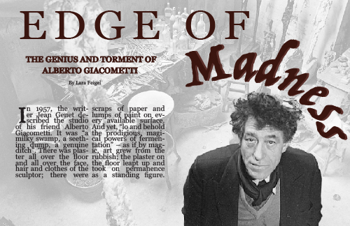
For my project I chose to create my opening spread over Albert Giacometti. For the opening spread, I chose the image of him in his studio as I felt that it embodied the story and expressed the chaos that surrounded Giacometti. To make it work well for my spread, I cut out Giacometti and layered him so that he would remain in full color as I increased the opacity of the surrounding image. I also chose to use Trattatello as my font for the word madness and then in the headline in the sidebar on the second spread to build that sense of connection between the first and second page. I felt this font mimicked the length and of Giacometti’s sculptures but also felt like a font that stereotypically associated with insanity and chaos. The rest of the typography for both the opening and second spread was Georgia to make the Trattatello stand out more. I also used the eyedrop tool to pull a red from one of his paintings to use as the color of my typography which helped to create a connection between the pages.
For my alternative story form, I used the six icons of British design and created circles that I imported the images into. This gave my design a sense of organization and looked clean but felt more creative than using squares or a more stereotypical shape. The boxes that I used for the list numbers helped them stand out more and created a sense of unity throughout the design.
Overall, this project challenged me both creatively and as a graphic designer. I was able to continue practice using InDesign which helped me get significantly more comfortable with the program and the commands. The choices I made were very intentional and required a significant amount of thought and time. I am happy with the way that my project turned out and the way it looked when I printed it out.