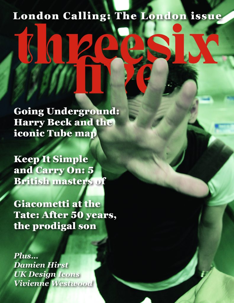
My main aim for this Harry Beck tube map spread was to let the subject matter lead the design by using Beck’s own design principles to tell his story. I think this approach was successful, as the geometric layout, color palette, and clean typography all work together to tell a story about design revolution.
The key takeaway from this project was to let content inform. By arranging text blocks with the same clarity and logic that made Beck’s map so great, I created a dialogue between his work and modern editorial design. I could have taken this further with more dynamic text layouts that truly mirrored his spatial innovations. This project taught me the balance between honoring historical design and meeting modern readability needs; a tension that actually made the final piece stronger and gave me a framework to use in future publication work.

