For our third project in J365, we had a lot of flexibility and freedom! We were directed to create a poster about any topic of our choice, as long as the design elements were original and it was advertising a product, service, or event. I enjoyed this assignment, as I was able to design something that excited me! Thus, I found myself choosing to spend hours working on it over my other homework because I was passionate about the topic and wanted to see the finished result.
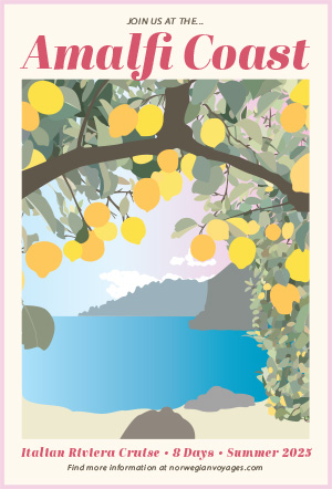
For my poster project, I chose to create an advertisement for an Italian cruise along the Amalfi Coast. I recently found out that I’m studying abroad in Florence this fall, so Italy has been on my mind nonstop. I’ve also been seeing photos and videos of how beautiful the Italian coast is, so I wanted to recreate it myself. When choosing a reference photo, my two requirements were something with lemons and water. I chose this picture because I liked the difference between the foreground and background.
Originally, I didn’t realize how tedious the process of drawing out every single leaf on the tree would be. This alone took 3 days and I spent 90% of my time on this project with making the leaves. However, I stuck with my idea because I wanted to challenge myself; I knew the harder it was in the moment, the more proud I’d be once it was finished.
This poster was made entirely on Adobe Illustrator with the pen tool. I wanted the style to mirror my freshman year dorm wall art (posters with 2d art in the middle and a light-color border around it, featuring text on the top and bottom). My goal was for this poster to double as a real advertisement, as well as something that a teen girl would think is cute enough to hang up in her room.
The two biggest lessons I learned with this design was that making multiple layers is crucial, and you can’t let yourself become lazy. When I started the poster, I made a few layers of the bigger pieces (sky, rocks, water, sand, etc.). However, I chose to keep all of the leaves in one layer, and although it worked out in the end, I would’ve been much more efficient if I separated them into a few layers. Especially towards the end of the process, every time I made a new leaf, I had to hold my “send to back” keys for at least a minute until I found the perfect overlap position. My second lesson was that you can’t let yourself get lazy! In the beginning, I made every leaf its own shape and unique color. By the end, I desperately wanted to copy a clump of leaves I already made and paste them into the new area. However, this would be obvious to the poster viewers and would decrease the quality of the artwork. When I did duplicate a few leaves to save time, I made sure to change the color and shape so they weren’t identical.
When I finished the artwork portion, I realized it looked bland and faded. The italy I’m used to seeing is bright and colorful, but my poster didn’t reflect it. This is why I went back and changed the light blue sky to a pink gradient sunset. Additionally, I added a more saturated blue gradient to the water and made the lemons three bright shades to add texture, layers, and color variance. Next, I added the text. I searched for a font that screamed “Italy” and “vacation” all at once. I ended up choosing Abril Fatface because it was bold, fun, and quite frankly, reminded me of gelato. For the bottom text, I used the same font style for the trip information, and added a sans serif font at the bottom with the link to Norwegian Cruise Lines’ website. I thought adding a call for action would help make the poster seem more purposeful and real. Lastly, I added a pink border to match the hues of the sunset.
Overall, this was a fascinating project! My reason for taking J365 was to become comfortable with Illustrator (specifically the pen tool), and I feel that through these past few weeks, I went from hating Illustrator to loving it! I never felt like a true graphic designer because I always used at least one pre-made element, so it felt very rewarding to know I created this poster from start to finish. I’m excited to keep designing artwork in similar styles, and to show off my first piece of real graphic design!