Please click on the image to go to the full published website!
Out of the three projects, I definitely felt most nervous to begin this one because I had little to no experience with HTML or CSS coding. I was surprised that I actually found it to be a very fun experience. Coding always seems daunting at first, but once you gain a deeper understanding of the language, it becomes an exciting challenge to try and decipher it.
Where I struggled most with this project was getting used to the overall structure of the language for HTML and CSS. I had to use conscious effort to make sure I was focusing on individual parts as their own pieces to the puzzle instead of becoming overwhelmed by looking at the entire coding script. That was especially important when I encountered errors and had to find what exactly had gone wrong. That being said, it was also extremely satisfying when the coding worked and it produced the desired result. I have a long way to go in becoming proficient at this skill, but going through this project just motivated me further to continue working on my progress in the future.
Overall, I appreciated that this project didn’t just allow us to apply a new skill, but also gave us a chance to reflect on all the work we’ve done over the past six weeks. I feel like I have learned so much over such a short period of time and I am excited to use this momentum to keep learning from here.
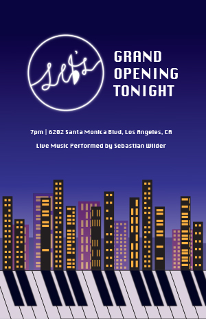
My concept for this project was inspired by the movie La La Land, which I recently re-watched. At the end of the movie, one of the main characters, Sebastian, opens up his own jazz club – a lifelong dream of his. The aesthetics and musical themes of the movie make it one of my favorites, so I decided I wanted to create a poster for Sebastian’s jazz club, Seb’s.
Sebastian plays the piano, and it is the central instrument of the movie. I wanted to incorporate that in my design, as well as the cityscape of Los Angeles, where the movie takes place. Thinking about the shapes of piano keys, I realized I wanted to create a design where the black keys on the piano could form the shadows of the city skyline, integrating both elements within each other. It was challenging at first to figure out how exactly I wanted to execute that vision, though.
What really helped me was creating multiple thumbnail sketches that allowed me to try out different angles and variations. When I first started my blank document, I also went straight to the piano keys first and played around with a few different features to see how they might be able to be warped or manipulated. Establishing the alignment of the keys with the buildings and making the layout aesthetically pleasing was definitely my biggest challenge. I wanted to make sure that my vision came across. That is why I also applied a slight gaussian blur to the black keys of the piano to make them appear more like shadows. I found that also making the piano keys a slight off-white color helped tie the composition together better.
I really enjoyed trying out different variations of shapes and colors with the buildings and windows of the city skyline. I used the shape tools in Illustrator to help, and also layered more buildings in the background with reduced opacity to add depth to the image. I kept the buildings in the foreground black to emphasize the piano’s keys, but added in purples, pinks, and blues in the background to create an analogous color scheme. Overall, I am definitely pleased with how this part turned out.
While the movie has its own logo for Seb’s, I knew that we needed to create our own original designs for this project, so I designed my own variation of the logo using the pen tool. The original logo has a music note for the apostrophe in “Seb’s,” and I wanted to keep that element in some way. So, I added it into the “b,” and created a tail at the top to make the letter reminiscent of an eighth note. I really enjoyed the process of making the logo appear neon, where I copied and pasted-in-place the design multiple times with gradually increasing amounts of gaussian blur. Not only does the logo appear as a neon sign in the movie, but I wanted it to act as a sort of “moon” in my design, providing the light source from which the shadows – the keys – originate from. That is why I also placed it a bit to the left of my design, since the “shadows” veer to the right.
For the rest of the typography, I chose a font that felt both bold and refined to maintain that “Hollywood” feel. I added my headline on the right of the logo to create visual balance, and included the secondary information in smaller text beneath that. I also created a dark gradient for my background to make the text seem even brighter and to represent a darkening night sky.
All in all, I really enjoyed the creative freedom we had with this project, and it was a unique challenge to come up with an original design. Navigating Illustrator has definitely gotten easier because of this project, and despite certain technical or design challenges, they were really rewarding to overcome. I am really happy with the final product.
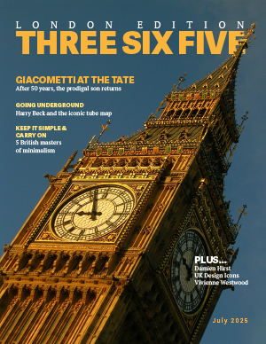
Before starting my design process, I knew that I wanted to focus on the story about Antonio Giacometti for my main article and the album covers for my ASF. My goal was to make the magazine appear as an homage to design in all its forms, not just through my choice of images, but through my layouts and typography choices as well. I wanted each page/section to have its own design story while remaining connected to the magazine as a whole.
Starting with the cover, I chose the image of Big Ben because I liked how clearly you can see the tower’s intricate details. It echoed the elegance and beauty that I associated with London and wanted to convey through the magazine. That is why I also incorporated a PT serif font on the cover, which I also used as my main body copy text throughout my other spreads. My headings I kept in a sans serif font to maintain simplicity against the complex background. It was really rewarding to be able to apply the sandwiching effect that we learned in the Bub cover tutorial here.
For my ASF, I definitely struggled at first to figure out how I wanted the layout to look like. At first, I tried creating a design using music staff lines, but I struggled with making it aesthetically pleasing. It took me a good while of brainstorming to figure out what direction I wanted to go in. Finally, I was thinking about what associations to music I could make with my design and, thinking about the music that the bands of the album covers played, I thought of an electric guitar. I decided to make a design where I could use the guitar frets as a visual for the ranking of the album covers. With some careful browsing on Adobe Stock, I found an image I felt was perfect for the mood and proceeded with placing the album covers from there. I had to alter the body copy slightly to make sure it could all fit, but I ended up with a design that I am very proud of. The body copy typography I kept consistent with the rest of the magazine, but incorporated the Phosphate font for my display typography because its lines remind me of a music record.
In my opening spread, I wanted the image I chose to reflect the title of the article, “Edge of Madness.” I started with an image of Giacometti painting a sculpture, but ended up changing it to an image of Giacometti standing in his messy studio. It was the perfect opportunity to preview the article by including the first paragraph on the opening spread that specifically addresses how messy Giacometti’s studio was. I used an Adobe Handwriting font for my descriptive typography because its scrawled and loopy look made it feel more personal to the artist (and also a little more “mad”). I incorporated that same font into the sidebar heading on my second spread. Finally, I wanted to keep the same “black and white” feel on my opening and second spreads, so I kept the color design minimal and simple. I only included a little bit of yellow highlight to add some variation and emphasis where needed.
Overall, this project was very challenging, but incredibly rewarding. I am proud of how much I improved in being able to think of a design that I wanted to create and then physically producing that design. I am excited to continue exploring InDesign and developing my skills more in the future.