Categories
P. Farrand Poster

FARRAND POSTER

Tyrese awesome poster
Click this image to see my design!

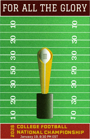
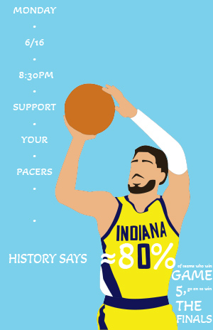
The most successful part of my design was the illustration I drew of Tyrese Haliburton. I was proud of my use of the pen tool. Although this illustration is not perfect (especially with a couple noticeable bumps on the basketball), I feel like it was a huge improvement in smoothness from the guitar. I also liked how I positioned him on the poster. I expect viewers to land on his face, and the direction of his jumpshot then guides the viewer to the important text about the time of the event. The text is then spaced out to guide the viewer into reading the statistic on his chest which incorporates my illustration into the text and largely prints the most important details about what the event is. In the future, I would plan to have more space on the right side of the page to display that text, as I admit it looked very scrunched.

The most difficult part of the project was creating and utilizing the Haliburton illustration. It was primarily fun, but I did struggled immensely with coloring and placement on the final poster since it seemed I was stuck between choosing a good looking quote in the bottom right or utilizing the leading that the illustration provides by looking at important text. I actually screwed up my use of the pen tool when making Haliburton by not creating closed shapes. I ended up having to import the illustration into Photoshop to use the magic wand tool for coloring, and then export it back to Illustrator. I do think if I planned a bit more on paper, I could’ve avoided my utilization issue, and if I had gone slower with the drawing I could’ve caught my illustration issue too.

I need to work on planning ahead. I really like my poster, and I wanted to avoid overwhelming the design. I like simple design. I think if I had put more intention into ideas in the planning process though, I could’ve had an even better piece. I knew I wanted to utilize the number on Haliburton’s jersey for dynamic text on the poster and also take advantage of his jumpshot for leading the viewer, but it does seem like my poster runs out of ideas after that. Next time, I want to flesh out every element instead of having a couple good ideas and trying to run with it. Overall I am happy with how it turned out, but I know with more prep I could have done even better.

Categories
C. Liu Poster

MEOWMENT Poster

Chenxi Liu‘s poster
Chick this image to see my design!

My goal with this poster was to capture a cozy, playful vibe that feels like an invitation to a pet-friendly gallery show. I focused on two tumbling cats to signal fun right away and kept the layout clean so the event details stay clear. A cream-to-honey gradient sets a warm stage, while a bright honey-orange highlight on the date line draws the eye. All artwork is original vector; I used a single 1-pt charcoal stroke to keep every element consistent. The toughest part was balancing “cute” with readability—my early drafts were too busy, so I trimmed extra paw prints and recentred the text block. Next time I’d explore variable-weight lettering for the headline and add a light paper texture earlier in the process to avoid late-stage color tweaks.

Categories
G. Vitz Poster

Angelmania Poster

Gaven Vitz'z Poster
Click to see full image!

My poster goal was to market the beauty of the Philippine Blue Angelfish and raise awareness to a 40% off deal. This fake event would be on a  timely basis showing the limited-time offer marked in  a bold and easy to read format. I had an aim that the poster should be modern and minimal and have a good flow.I started by drawing one of my own angelfish in Adobe illustrator, so that the design could be viewed as more personal and real. I focused on leading lines in the fins to assist in guiding the eye on the picture. I colored the drawing using a monochromatic color scheme created by adobe. Then I imported the drawing to Photoshop to clean it up and save it as a PSD file. The reason why I did this  was to make the final layout in InDesign,where I concentrated on the type and spacing (I find it the easiest here). Among the deliberate decisions, one was to make the shape of a triangle, which also makes a sort of a directional flow towards the upright title, thus contributing to defining the visual background of the whole composition. I think that the most powerful aspect of the work is that headline, as it identifies the piece immediately. Vertical composition, the shape of a triangle, and directional lines on the fish form a natural flow that the viewer can follow. It renders the design to be harmonious and self-assuredThe greatest difficulty was how far to take on the visual detail without overloading the statement. I was inclined to minimalism, and in the future, I would like to develop and incorporate some sort of soft texture or even some background images to enhance the composition with the layout remaining open. All in all, I am proud of the poster. This project allowed me to develop my skills in combining several tools and programs, such as Illustrator, Photoshop, and InDesign, in a single workflow, and realize that well-thought choices can direct the experience the viewers have.

Categories
C. Schuler Poster Uncategorized

Football Poster

For this project, I made a poster about next years upcoming college football championship

View the full image

My goal with this poster was to create a rough, old school aesthetic that looked similar to a vintage sports poster. I kept it simple by putting the trophy at the forefront to communicate the significance of the match. used a high contrast color palette to make the visuals pop. To achieve the rough texture of the poster, I used a stock photo of field turf and used the “Soft Light” transparency mode. The most difficult part was adding the details on the trophy to make it look more like an actual object. Lots of tracing and retracing were done for this. As a designer, working with shapes and how to orient them better is something I can improve on. I could’ve added some more depth using the Draw Inside tool.

Categories
C. Johnson Poster

Invincible Poster

Click to see the full image

For our third project in J365, we were tasked with creating a poster from scratch surrounding a topic of our choice so long as it fit into the basic guidelines of the assignment. I decided to create a poster for the show Invincible. I had noticed a lack of posters around the show that weren’t simply still shots from episodes, so I saw an opportunity to create an original concept for a poster surrounding the show. This project created an opportunity for me to learn, adapt, and utilize the tools within Adobe Illustrator and really challenge my creativity, originality, and skill set.

When beginning, I had come up with a varying amount of concepts. I knew I wanted to surround the project around Invincible because I had started watching the show and really appreciated the story but also the origin. Invincible is an animated version of it’s comic counterpart, so I wanted to draw inspiration from it’s beginnings for this poster. Many of the concepts I had initially came up with looked as if they were comic book covers, and I really wanted to stick with that concept but also create something that was typographically focused with illustrative elements. I had decided colorful silhouette design.

For the typographic elements, my decision-making skills were put to the test. I searched through adobe fonts, wanting to find a balance between the typography used within the show, the comics, but also original. In the end, I decided on Abolition which is a font I found using Adobe Fonts. I felt that the Abolition font is bold, but readable while leaving an impact. For the main headline “INVINCIBLE” I distorted the text using the distort effect. It took many tries to fit within the yellow box I had placed behind it as a guideline

My process for creating the silhouette was frustrating, but the effort I put into the design taught me how to really simplify and work with a mouse and the pen tool within Adobe Illustrator. I first found some reference photos, looking at both the character design of Invincible himself, but also side-profile portraits. Using those reference photos, I used the program Procreate to create a sketch of what the final silhouette came to be. After the sketch was finished, I imported it into Adobe Illustrator, and this is where the challenge began. Before this project, as well as the in-class practice, I had no prior experience with Illustrator, let alone the pen tool. But, after quite a few tries, I got the exact outline that I had envisioned. I adjusted quite a few lines, curves, and overall composition within Illustrator in order to create a visually appealing graphic. Initially I only planned one centered silhouette. But, I had experimented with scaling and copying and decided that I wanted to fill more space and create a directional force that followed the typography, which led to the final 3 silhouettes being included.

The colors throughout this poster were very intentional. Each silhouette is themed around the variants of Invincible featured in season 3, with some creative liberties being taken on my end. I know that I wanted his original suit of yellow and blue to be a driving force when it came to the overall color theme of the poster because it is a recognizable element. This lead to the choice in background colors following that theme. The text border is based around the largest silhouette of blue and yellow. The 2nd silhouette is based around the suit that he is depicted in during season 3, I felt that this was important to include because of the recent season wrapping up around when I began composing this poster. The final silhouette, straying away from the dominating blue, is meant to be his “omni-man variant” from season 3. I thought that the red and white would really create a “pop” in the poster, and give the eyes a break from the blue, yellow, and black colors. The order of the silhouette colors are also intentional, representing the change and fear that Invincible faces throughout the series. I decided on black for most of the typography to contrast well with the vibrant colors around the poster, with a yellow “Streaming Now” in order to grab the viewer’s attention as to what is being advertised.

Overall, this project really helped me hone my skills within a new program that I now will be using for most, if not all, my personal projects outside of class. The pen tool, though frustrating at times, was rewarding to become well-acquainted with and I feel far more confident in the techniques required when using the pen tool. Implementing color theory, creative typography, original graphics and an overall appealing composition was challenging, but one of the most personally rewarding projects that I have done for this class.

Categories
A. Vaysberg Poster

Amalfi Coast Poster

Click on the image to see full version

For our third project in J365, we had a lot of flexibility and freedom! We were directed to create a poster about any topic of our choice, as long as the design elements were original and it was advertising a product, service, or event. I enjoyed this assignment, as I was able to design something that excited me! Thus, I found myself choosing to spend hours working on it over my other homework because I was passionate about the topic and wanted to see the finished result.

For my poster project, I chose to create an advertisement for an Italian cruise along the Amalfi Coast. I recently found out that I’m studying abroad in Florence this fall, so Italy has been on my mind nonstop. I’ve also been seeing photos and videos of how beautiful the Italian coast is, so I wanted to recreate it myself. When choosing a reference photo, my two requirements were something with lemons and water. I chose this picture because I liked the difference between the foreground and background.

Originally, I didn’t realize how tedious the process of drawing out every single leaf on the tree would be. This alone took 3 days and I spent 90% of my time on this project with making the leaves. However, I stuck with my idea because I wanted to challenge myself; I knew the harder it was in the moment, the more proud I’d be once it was finished.

This poster was made entirely on Adobe Illustrator with the pen tool. I wanted the style to mirror my freshman year dorm wall art (posters with 2d art in the middle and a light-color border around it, featuring text on the top and bottom). My goal was for this poster to double as a real advertisement, as well as something that a teen girl would think is cute enough to hang up in her room.

The two biggest lessons I learned with this design was that making multiple layers is crucial, and you can’t let yourself become lazy. When I started the poster, I made a few layers of the bigger pieces (sky, rocks, water, sand, etc.). However, I chose to keep all of the leaves in one layer, and although it worked out in the end, I would’ve been much more efficient if I separated them into a few layers. Especially towards the end of the process, every time I made a new leaf, I had to hold my “send to back” keys for at least a minute until I found the perfect overlap position. My second lesson was that you can’t let yourself get lazy! In the beginning, I made every leaf its own shape and unique color. By the end, I desperately wanted to copy a clump of leaves I already made and paste them into the new area. However, this would be obvious to the poster viewers and would decrease the quality of the artwork. When I did duplicate a few leaves to save time, I made sure to change the color and shape so they weren’t identical.

When I finished the artwork portion, I realized it looked bland and faded. The italy I’m used to seeing is bright and colorful, but my poster didn’t reflect it. This is why I went back and changed the light blue sky to a pink gradient sunset. Additionally, I added a more saturated blue gradient to the water and made the lemons three bright shades to add texture, layers, and color variance. Next, I added the text. I searched for a font that screamed “Italy” and “vacation” all at once. I ended up choosing Abril Fatface because it was bold, fun, and quite frankly, reminded me of gelato. For the bottom text, I used the same font style for the trip information, and added a sans serif font at the bottom with the link to Norwegian Cruise Lines’ website. I thought adding a call for action would help make the poster seem more purposeful and real. Lastly, I added a pink border to match the hues of the sunset.

Overall, this was a fascinating project! My reason for taking J365 was to become comfortable with Illustrator (specifically the pen tool), and I feel that through these past few weeks, I went from hating Illustrator to loving it! I never felt like a true graphic designer because I always used at least one pre-made element, so it felt very rewarding to know I created this poster from start to finish. I’m excited to keep designing artwork in similar styles, and to show off my first piece of real graphic design!