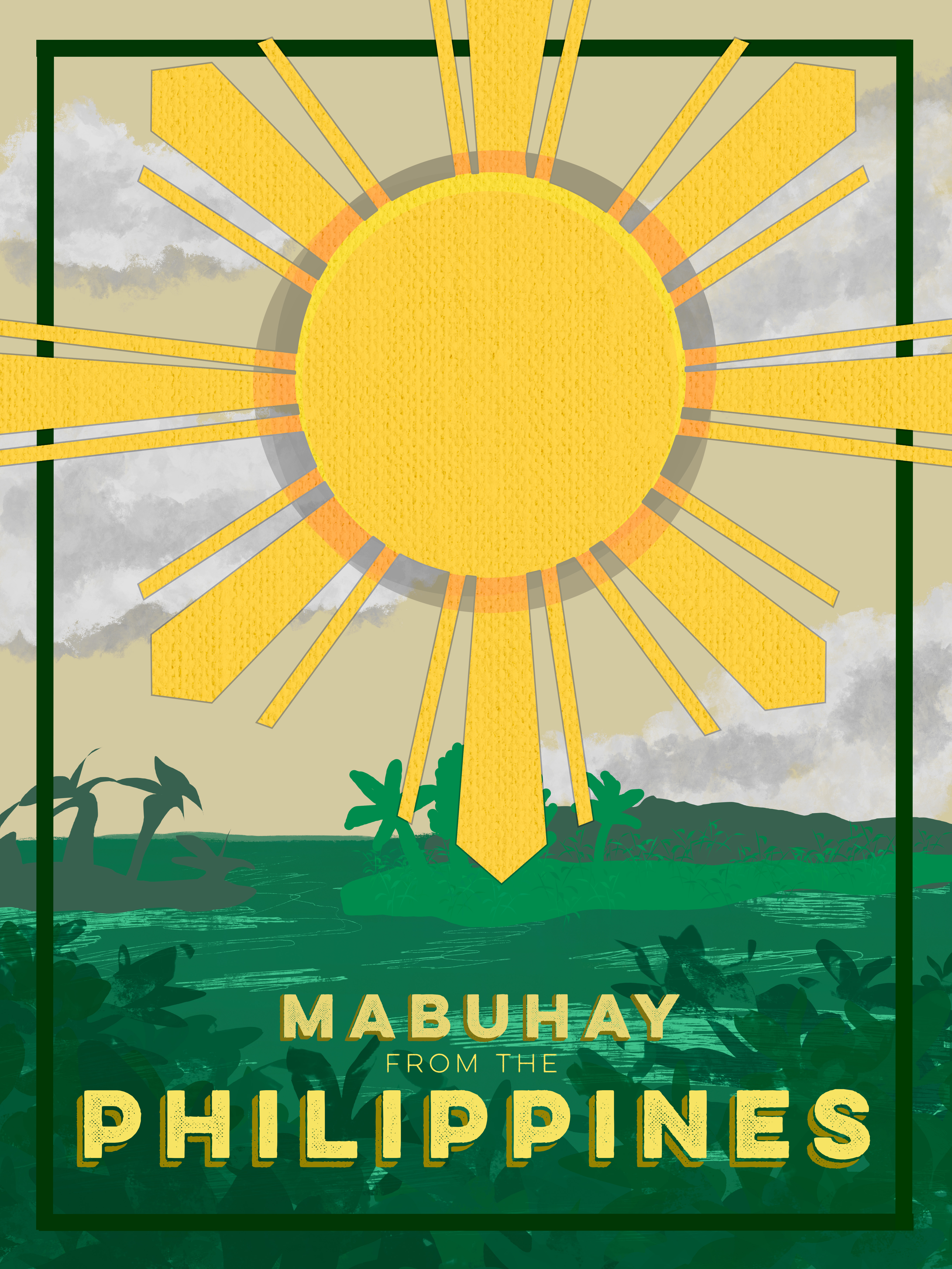
I took my own spin on the project, and I made a poster capturing a country. The event itself is coming to that country to explore and enjoy what it has to offer. The poster design I chose was a poster that I would hang on my wall. It has the Philippine sun on the front with a woven texture to capture the country’s known design of wicker and threaded items. I used greens and light sandy browns to capture the lush greenery found in the Philippines with the typography “Mubhay” which also means “Welcome” in Tagalog, the native language of the Philippines.
I learned a lot from this project, and it took a lot of layers and redesign to get it to where I like it. I am not particularly proud of this poster and wish it could be better, but that’s because I designed it. I tried taking various elements from other Filipino event posters and tying them to my own work and design. I drew a lot of things on the illustration poster and used various brushes to create something that matches the overall theme.
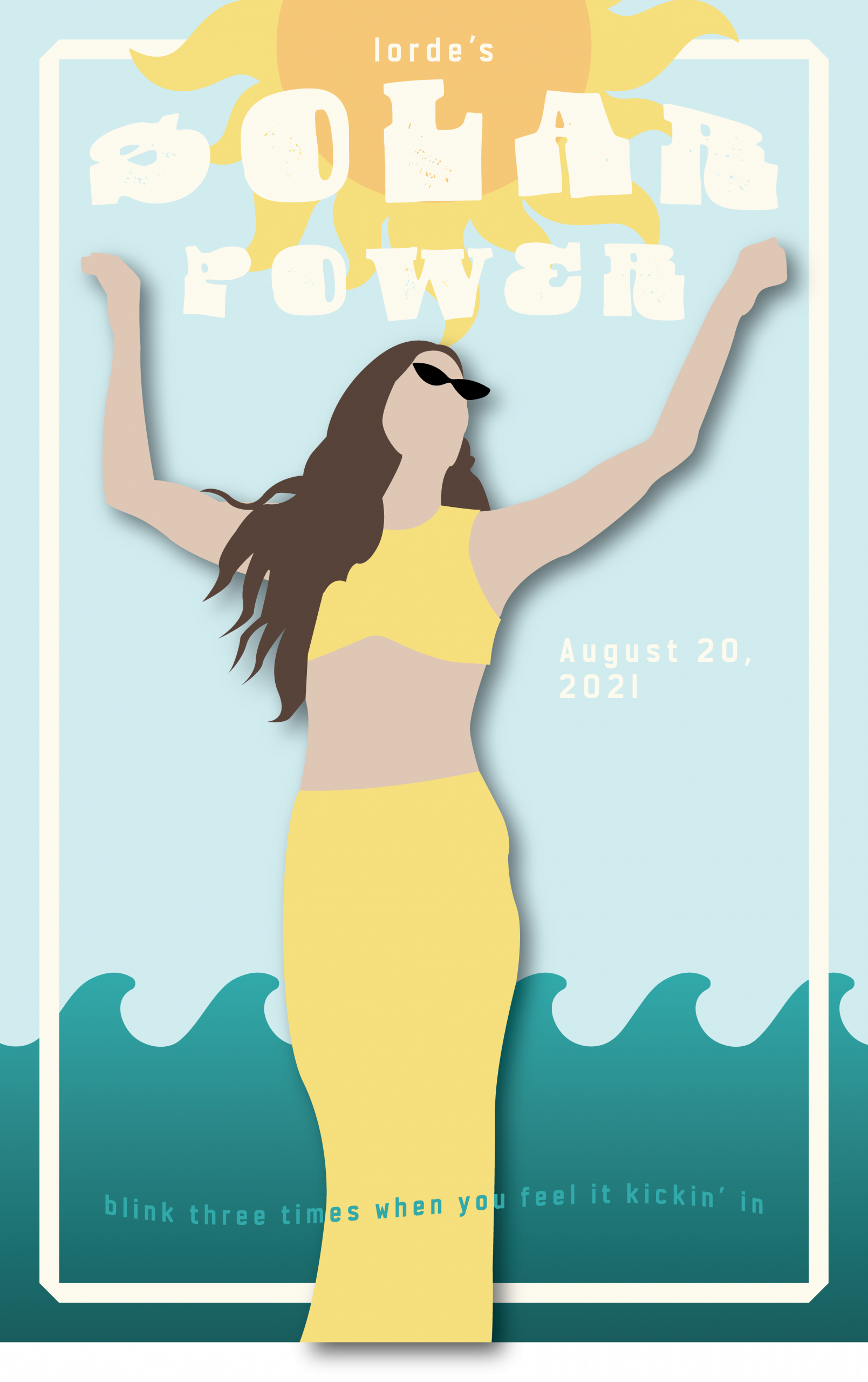
My goal was to create a vibrant, summer-inspired poster that captured the energy and freedom of Lorde’s “Solar Power” album through warm colors, balanced composition, and authentic connection to the music’s themes. I believe the final product was successful in terms of these objectives. The yellow and blue color palette effectively conveys summer vibes, while the central figure with raised arms creates the sense of celebration and liberation I was aiming for. The typography integrates naturally without overwhelming the design.
I started with sketches exploring different compositions before settling on the figure-centered approach. The biggest challenge was achieving the right balance between the text and visual elements. Creating depth in the flat, paper-cut style was also difficult.
The cohesive color story is my strongest achievement. The warm yellows and cool blues work together to create a calming feel, while the layered composition creates unity between all elements.
I need to develop stronger typography skills, particularly in creating more sophisticated hierarchies and text-image integration. This project taught me how color and composition can create emotional impact while balancing artistic vision with clear communication.
My Goals for this poster was to go out of my design comfort zone and make something in a style I don’t normally use. Mainly having a sans serif font as the main font used cause I tend to gravitate towards serif fonts. My creative process consisted of a lot of sketching and thinking about what choices I wanted to make and overall how I wanted the vibe/look to be. I looked for inspiration on pinterest and made a board to save any color combinations or posters that I like design elements in.
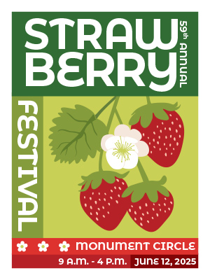
I think the colors in my poster are pretty good, I stuck mainly with green and red (because strawberries) and I am happy that it doesn’t read as christmas cause that can easily happen with green and red. I think the illustration of the strawberries also turned out really well. It is still cartoonish while maintaining a good amount of realism. I think the placement and sizes of the text were hard to perfect and deciding how much/little detail to give about the event. In the future when I work on posters I want to work on my illustration and make them more stylized along with more detail.
Going into this assignment my main goal was to learn how to better use Illustrator. While I am familiar with the program and have used it for small projects, I have never created something on this scale before. Due to this I wanted to learn more about the different tools that Illustrator has and utilize them to create my design. I especially wanted to fine tune my pen tool skills. As a whole I think that I met those goals within this project. Throughout the unit and my project, I found that I was able to significantly improve my Illustrator skills, including making smooth bezier curves without any unwanted, sharp points. I also found myself becoming far more familiar with the tools in illustrator, utilizing symbol sprayer, color guide, and gaussian blur effects, throughout my design, bringing it to life.
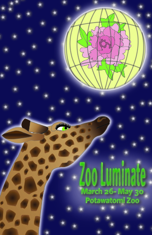
For my poster project I decided to make a poster for an event that recently ended at my local zoo. It was called Zoo Luminate and our entire zoo was decorated with Chinese lanterns in the shape of zoo animals. The lanterns were all really pretty and I instantly thought that this would be a great event to make a poster for. I decided to focus on two different lanterns for the design; a traditional Chinese lantern and a lantern at the event that looked like a giraffe. I chose the giraffe because the giraffe lantern greets visitors at the zoo entrance; the giraffe is also one of the zoo’s main attractions. Since it was a central component to the event and to the zoo as a whole I thought it would be great to include a giraffe in the design. I decided to use the traditional lantern to visually represent the event and had it placed in the sky like it was a moon.
I think the part of my design that was the most successful was the giraffe, though I might be partial to it since it was the component of the poster that took the most time. I spent a lot of time fine tuning the details, trying to give it character while making it look accurate without being too flat. I spent a lot of time drawing each sploch on the giraffe so that they were the right shape and size and adjusting each of the radial gradients to make sure they looked right. However, the giraffe was also one of the most difficult parts of the project because during most of the work it looked too flat compared to the rest of the design. This turned out to be the hardest part; making the whole design cohesive but also alive. Early on in the project I added some gaussian blurs and backlighting on the lantern and the stars to make them look like they were glowing, which created a cool effect and helped make the elements look less flat. I duplicated the text, applied a heavy gaussian blur, and made it a darker color to add texture and color to the text to make it look less flat. These changes made the giraffe look slightly off compared to the other elements . I spent a lot of time trying different things to get it to not look so flat. I tried adding a gaussian blur to the giraffe and some backlighting, which looked good but didn’t fix the problem. I kept changing and modifying the giraffe but it still looked flat. Eventually after a couple of days of sitting with the problem I realized that the giraffe was pretty pale and that the singular color I originally had on the body of the giraffe was the issue. I added a gradient and made the giraffe darker and it just pulled it all together. Looking at the poster now, I think I overcorrected a little bit and made the giraffe too dark, but I still think it looks pretty good.
Overall, I didn’t really have any parts of this project where I felt like I made any big mistakes, which is good. I made a couple of small mistakes with layering, like making a layer over another layer when it needed to be below it. In the future I think I will also be more mindful of when I create a layer from the beginning of my design because I found myself having to create layers or move things from one layer to another while I was in the middle of editing. Besides those issues, I think for my next project I want to spend more time playing with Illustrator and experimenting with different effects and tools. While I feel like I did a good job using the different tools that were in our tutorials, I didn’t spend a lot of time exploring the other things that Illustrator offers, especially when it comes to different textural effects that it has. I think I also want to utilize the path finder tool next time since I didn’t really need to use that in this specific design.
As I continue to learn more about design through this course, I feel like I am getting slightly better and more confident in my designs. I am fairly new to graphic design skills but have learned a lot in this course. For my poster, I struggled to think of an idea for a design so I created a visual that I feel like I know very well. I wanted a simple design so that each element could be more thorough and intentional with the details.
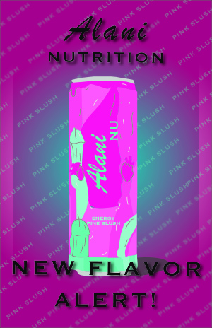
I wanted to stick to the color scheme of the can so I kept the design pink and teal with black accents to highlight the name of the flavor and can’s theme. Drawing the can was very difficult because there are so many details on it but I tried to make it as realistic as I could. I really enjoy using Adobe Illustrator but this course is my first time using it so I am definitely still learning all of the tools. I kept to two fonts to match the styles on the can and highlight specific words to intentionally match their importance on the page. For the background I kept the colors simple yet on theme with the elevated gradient effect but added the flavor name repeating with some of them blurred as they reach the end of the page.
Although my poster is not an expert level design, I think each element fits perfectly and it reflects how much I have learned in this course. I intend to keep working with Illustrator and hopefully build my skills and knowledge with the tools. I like how my poster turned out and feel like I will continue to get better and even add Adobe Illustrator to my skills.
For this post, I will explain the goals of my poster, explain how successful I feel I was in accomplishing said goal, and give an analysis of my process, determine which areas best displayed my skills, show what was most difficult, and look at where I must improve.
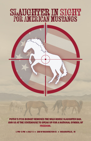
First, I should express the purpose of this poster, as my topic choice is very niche. I chose this topic because I am an advocate of wild horse management and a long-time equestrian. Right now, our president’s Fiscal Year 2026 (FY26) budget aims to not only remove the ban on American mustang slaughter but also decrease the Bureau of Land Management’s (BLM’s) budget by 25%, thus endangering the Wild Horse and Burro Program and the 64,000 wild horses and burros currently being held in captivity after having been captured from their ranges in the Herd Management Areas (HMAs). The budget will also make it easier to sell animals and remove their protected status. Finally, not only may the government “dispose of” the “excess” animals, but it also increases the probability of horses being shipped to Canada and Mexico–where they may be legally slaughtered for pet food or human consumption. Thus, this poster acts as an outlet to the frustration that I, and many other wild horse advocates, feel. My goal was to quickly and efficiently educate the public and welcome them to a public protest, where they may learn more about this issue. Even without reading the smaller text, the headline is a shock that should encourage civilians to do additional research. Because American wild horses/mustangs are generally considered national symbols of freedom and remnants of the American Wild West, I wanted to appeal not only to animal lovers (and draw attention using a horse silhouette), but also to those who care deeply about this nation (by using the flag). We usually associate America with Bald Eagles, but many also remember the wild horses running free in the West–the escaped horses of the Spanish settlers, the “mestengos”. Wild horses are in America’s DNA. My ultimate goal was to inform the public that a symbol of freedom and American history is now under attack, and we must fight back.
With respect to my design goals though, my hope was to create a dynamic, striking poster that was simple yet effective. I tend to overcomplicate everything, and I wanted to focus on a simple concept that still showed how much effort I put in. My goal was to use the rules of design correctly and make a layered, technically difficult illustration that quickly informed readers while pushing my new designing capabilities.
Next, I believe that I was fairly successful in my goals, and I will explain my reasoning behind my claim, as well as explain which aspect was the most difficult and why. First, I used many design techniques/rules in this class, implemented strategies written about in my last post, and remained loyal to the techniques/rules of design that we focused on this semester. Regarding techniques used, I began with a rough design that focused on the Wild Horse and Burro Program logo drawn inside a sight, with an arched headline wrapping around the sight, as well as a dark and light red-striped background and stars surrounding the sight. I moved on to craft another design mimicking James Montgomery Flagg’s “I WANT YOU”/Uncle Sam poster; the sketch had two colors offsetting the poster, navy/beige/red color scheme, sans serif font, and a simple background. However, the designs were all too busy and highlighted the American flag too much. I then tried using a photo of a flag with reduced opacity as my background, but this idea failed because the text was lost in the flag’s pattern. Thus, I improved from the last project and went through variations of my sketches, allowing myself the time to change elements; this choice (to redesign my poster multiple times) and the hours of placing, grouping, clipping, and altering the flag’s components were the most difficult parts. With the time, frustration, and inability to effectively use the flag making me feel like a bad designer, I often considered switching my topic. I moved forward though, intending to make a waving flag later in the process, and hence drew my horse’s body, mane, tail, and hooves with the pen tool and grouped them together; I created my sight by using the ellipse, rectangle, and pen tools. I then drew my flag using the star and rectangle tools and used my shape mode and pathfinder tools to merge my rectangles and join everything into a combined element. After days of figuring out how to incorporate the flag to invoke national pride and urgency towards my plight, I decided to make an opacity mask. I drew an additional ellipse, the same size as my sight and made a mask to use over my flag; once finished with reducing the flag’s opacity and setting my mustang outline in front of it, I set my sight in front of both elements. Before settling on using the mask, I also experimented with my warp, mesh, envelope distort, and lasso tools, as I initially wanted a perfect, waving flag. To further add to the illustrations, I used the texturizer to create a canvas fabric for the flag (with lighting coming from the top-left), and I added a canvas texture to my horse, complete with a small drop shadow to separate my silhouette from the flag (again with the light coming from the top left). Because I could not directly put the BLM’s Wild Horse and Burro Program logo (copyright issues), I made my horse’s silhouette a bit like its own little version of a logo/badge–hence the repeated use of a canvas texture rather than hair/hide. Notably, the textured background is an Adobe stock photo of mustangs, but the opacity is lowered, so a beige rectangle shows through and lessens the vivid colors. Colors were chosen using the Uncle Sam poster and US flag, but because I wanted RGB and CMYK color schemes to translate easily between web images and print design, I altered the colors and made them less vivid; the scheme used beige (background), blue (flag, stroke for the horse, background), and red (lettering, sight, flag). My horse was left white, to represent purity and the flag, while the red represented blood and the flag. The blue tied the flag, background, and horse elements together but had no significant meaning. For lettering, I used Kiln Serif, because although I did not want to use a serif font on my poster, I liked the “blood spatter” look of this font, as well as the “Wanted” poster aesthetic. I used Franklin Gothic Demi Condensed for my smaller type, as it resembled the typography from the Uncle Sam poster. The lettering hopefully also added visual echoes by using the same red hue used in the sight as some of the type. For this project, I also created hierarchy and visual flow, with the large illustration set just above the center of the poster to grab attention; viewers then look up to the smaller headline, and finally back through the illustration and to the bottom of the poster (with the smallest text and information/meeting time). To use the negative space in my textured background, I made the horses run through the blank space. I also think that I created interactions in my design by reducing opacity and setting elements within/below others. Notably, the circular glyphs are supposed to create an additional visual echo. To add dynamic alignment, I set the flag’s stripes at the same diagonal angle as the rearing horse’s back. For another design strategy, I used the golden ratio/section, as the grouped headline and illustration take up 62% of the used space. Finally, I do believe that I achieved my goal, because I used many design strategies and rules, while also spending hours ensuring color would translate better between mediums (which was my issue with the magazine project). Furthermore, I believe that I followed many (though not all) of Müller-Brockmann’sideas, as my poster is readable, shows simplicity of design, abides by the three-face maximum rule, adds emphasis with a limited color pallet, imparts information quickly, and maintains symmetrical balance (while using a diagonal composition within the illustrated element). I feel that I created a meaningful design while following design rules, and I have improved my skills since the last project.
Moreover, my design had strengths and weaknesses. I believe that the horse illustration showed how much I have improved with the pen tool, and the flag’s design and position in the layers indicates that I now understand how to use design techniques. I am very proud of my illustration, and I used some tricks and strategies that we learned in class. With grouping and editing, I made my flag similarly to how we made the frets of the guitar and used the pathfinder and shape modes. I used the opacity mask similarly to how we used a mask in the handout for the “beans” poster. Yet, I will say that the horse’s right hindquarter was incredibly difficult to draw. The animal in my reference photo was at an angle where the right hind leg was wider and straighter looking than the left one. I tried to fix the issue when I drew the animal with the pen tool, but I still think that the leg was a tad “wonky”, even after redrawing it multiple times. I do think that I captured the odd curvature of the leg though, where the femur, patella, and tibia meet. Of note, with respect to the lettering, I regret my choices. I made sure that my words were the same length as the sight’s diameter, but in doing so, my type was too small for a headline. I also regret trying to use typographic mass. I initially had the “Slaughter in sight” above the sight, with “for American mustangs” below. It looked better, but the text looked too straight when close to the round sight, and after also deciding that arched text would look too whimsical on such a serious poster, I tried using typographic mass and grouped the text. I think that this was implemented poorly, as the text is too small for my headline, and the lines of text are not even in their width. While I liked the design in the moment, looking back, it looks silly. In the future, I want to work more with typography and its mass and use lettering as an art element within the poster.
Illustration is not a skill I feel very confident in. I struggled with the unit a bit and also had a few issues keeping up with the workload for outside reasons. Thankfully, I still learned quite a lot from the last two weeks. Adobe Illustrator is easy to use once you understand how it works. That does take a bit, though.
Click the image to see my design!
My poster is for a special event lecture that won’t actually be held. As much as I would love to hear an academic talk about the politics of author Franz Kafka’s work, I can’t imagine that would draw a crowd large enough to fill Shreve Auditorium. In a perfect world, it might.
My inspiration is the feeling of isolation and alienation present in Kafka’s work. This often happens to his characters at the hands of cold, bureaucratic systems that do not and have never made sense. Kafka lived in a world when industrial capitalism was brand new and he seemed to be terrified of it.
In The Metamorphosis, when the main character wakes up to discover he’s been turned in to a bug, his first thought is that he will be late for work. The man seems insane for thinking everyone will still want him to go to work. The reader will likely find it funny and an example of the character being highly anxious.
It turns out that everyone actually does still expect him to go to work. In Kafka’s mind, the world makes demands of us that are just as strange.
With this in mind, I drew a little roach and directed the eye to it with two far larger elements, including an arrow that serves as a guiding line. The text being so large is meant to make the bug feel smaller in comparison and create a feeling of insignificance. From there, your eye goes to the informational text.
I wanted Kafka’s name to be a secondary point of focus. To do this, I made each letter its own element, and then gave the characters different sizes, colors, and “warp” settings. I worry the end result might be a bit too loud, but efforts to tone it down didn’t give me much.
My color scheme started with red. I wanted that to be the background. When I needed to make other choices, Illustrator suggested the browns and off-whites. The red background was most important to me. Along with the texture, I wanted to create a kind of dirty feeling that might remind someone of rust and old houses (or roaches).
Admittedly, this involved me drawing very little. I am proud of my roach, though. I used a reference image but didn’t trace it directly, which is not something I thought I had in me. I hope that this is a satisfactory drawn element. I was, admittedly, a little stressed and afraid of the pen tool.
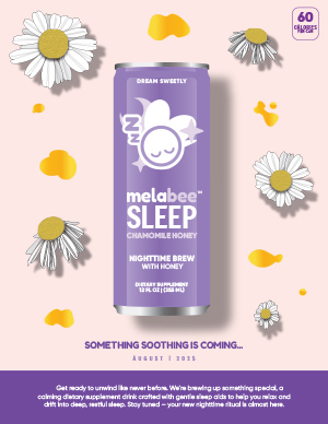
Because we had free reign to make anything for this poster project, I decided to create a product launch poster for my melatonin drink company, Melabee. This is a real product that I am currently working on with a team and we do expect to launch our final product in August so stay tuned!
My goal was to create a calm and dreamy atmosphere using our brand colors and symbolic imagery. The design conveys restfulness as well as anticipation for the launch. Everything was created from scratch, from each chamomile flower to the entire can, mainly using the pen tool and gradient tool to make each element come to life. No tracing or outside images were used, just reference photos of chamomile flowers and our product.
I applied design principles like balance, alignment, and contrast, so the layout guides the eye from top to bottom with clear visual hierarchy. I also used spacing to make sure every word was legible. In terms of typography, I used 3 main fonts that were already on the design of our packaging and applied it to any remaining text on the poster so that everything is cohesive.
As for my creative process, I started with a basic sketch of what my poster would look like before gathering realistic photo references for each graphic element and then drawing from scratch in Illustrator. Looking ahead, my goal is to keep experimenting with Illustrator to become more familiar with each tool, so that next time I open Illustrator to create something, the process is faster because I am more comfortable with the application.
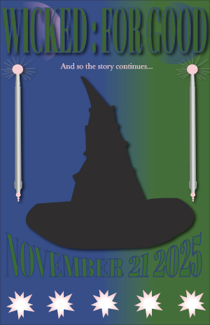
I had a few different goals for this project. Two of the main ones were to create a poster revolved around an interest of mine and to utilize skills that I learned in class. My final product met these goals in a few different ways. I centered my poster around the new Wicked movie coming out and this movie I am extremely interested in. I also utilized skills by using various tools which included the pen, gradient, eye dropper, star, and ellipse tools. I also utilized some text effects. To me the most successful and difficult part of my design were my drawings. I really struggled with the pen tool at first, so these drawings were not easy for me. However, I really enjoy the finished product. In the future, I think I need to work on adding more intricate details to my design.
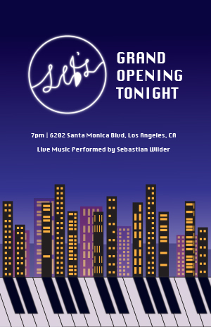
My concept for this project was inspired by the movie La La Land, which I recently re-watched. At the end of the movie, one of the main characters, Sebastian, opens up his own jazz club – a lifelong dream of his. The aesthetics and musical themes of the movie make it one of my favorites, so I decided I wanted to create a poster for Sebastian’s jazz club, Seb’s.
Sebastian plays the piano, and it is the central instrument of the movie. I wanted to incorporate that in my design, as well as the cityscape of Los Angeles, where the movie takes place. Thinking about the shapes of piano keys, I realized I wanted to create a design where the black keys on the piano could form the shadows of the city skyline, integrating both elements within each other. It was challenging at first to figure out how exactly I wanted to execute that vision, though.
What really helped me was creating multiple thumbnail sketches that allowed me to try out different angles and variations. When I first started my blank document, I also went straight to the piano keys first and played around with a few different features to see how they might be able to be warped or manipulated. Establishing the alignment of the keys with the buildings and making the layout aesthetically pleasing was definitely my biggest challenge. I wanted to make sure that my vision came across. That is why I also applied a slight gaussian blur to the black keys of the piano to make them appear more like shadows. I found that also making the piano keys a slight off-white color helped tie the composition together better.
I really enjoyed trying out different variations of shapes and colors with the buildings and windows of the city skyline. I used the shape tools in Illustrator to help, and also layered more buildings in the background with reduced opacity to add depth to the image. I kept the buildings in the foreground black to emphasize the piano’s keys, but added in purples, pinks, and blues in the background to create an analogous color scheme. Overall, I am definitely pleased with how this part turned out.
While the movie has its own logo for Seb’s, I knew that we needed to create our own original designs for this project, so I designed my own variation of the logo using the pen tool. The original logo has a music note for the apostrophe in “Seb’s,” and I wanted to keep that element in some way. So, I added it into the “b,” and created a tail at the top to make the letter reminiscent of an eighth note. I really enjoyed the process of making the logo appear neon, where I copied and pasted-in-place the design multiple times with gradually increasing amounts of gaussian blur. Not only does the logo appear as a neon sign in the movie, but I wanted it to act as a sort of “moon” in my design, providing the light source from which the shadows – the keys – originate from. That is why I also placed it a bit to the left of my design, since the “shadows” veer to the right.
For the rest of the typography, I chose a font that felt both bold and refined to maintain that “Hollywood” feel. I added my headline on the right of the logo to create visual balance, and included the secondary information in smaller text beneath that. I also created a dark gradient for my background to make the text seem even brighter and to represent a darkening night sky.
All in all, I really enjoyed the creative freedom we had with this project, and it was a unique challenge to come up with an original design. Navigating Illustrator has definitely gotten easier because of this project, and despite certain technical or design challenges, they were really rewarding to overcome. I am really happy with the final product.