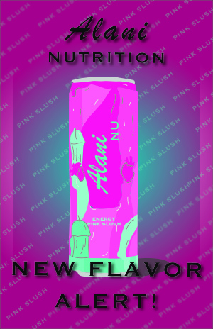
As I continue to learn more about design through this course, I feel like I am getting slightly better and more confident in my designs. I am fairly new to graphic design skills but have learned a lot in this course. For my poster, I struggled to think of an idea for a design so I created a visual that I feel like I know very well. I wanted a simple design so that each element could be more thorough and intentional with the details.
I wanted to stick to the color scheme of the can so I kept the design pink and teal with black accents to highlight the name of the flavor and can’s theme. Drawing the can was very difficult because there are so many details on it but I tried to make it as realistic as I could. I really enjoy using Adobe Illustrator but this course is my first time using it so I am definitely still learning all of the tools. I kept to two fonts to match the styles on the can and highlight specific words to intentionally match their importance on the page. For the background I kept the colors simple yet on theme with the elevated gradient effect but added the flavor name repeating with some of them blurred as they reach the end of the page.
Although my poster is not an expert level design, I think each element fits perfectly and it reflects how much I have learned in this course. I intend to keep working with Illustrator and hopefully build my skills and knowledge with the tools. I like how my poster turned out and feel like I will continue to get better and even add Adobe Illustrator to my skills.