Categories
J. Negus

My Website

Jane's website
Click to view a pdf of my website!

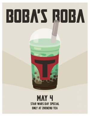
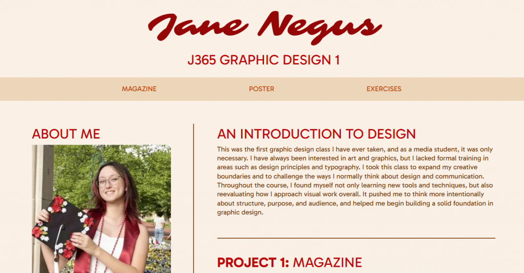
In my opinion, this was probably the most daunting project out of this class. I have experience in coding, but every time I try and do so, I always end up overwhelmed. This time, I allotted myself a plentiful amount of hours to work, so I would be able to take my time and not stress over it. My main focus for building this website was to keep it clean and simple, yet visually appealing. I chose a simple light beige background to be easy on the eyes, and used a brown body text over it. My header text is a more saturated color, meant to pop out. I also made the captions on the images lighter, so they would have less contrast than the rest of the text. Both my navigation bar and my footer are a darker but similar shade of beige, to draw attention and break up the page without being offensively contrasted. The fonts I chose were a calligraphic font for the title, and a friendly-looking sans serif for the headers and body. I chose these fonts because I wanted the page to appear welcoming and warm. I also used the border bars to break up the page a bit more and have clear sections. I made sure that everything on my page has a comfortable but not overwhelming amount of padding or margin. While the page is still a little bit simple, it conveys my purposes well and maintains readability. I am satisfied with the result, especially since it is my first successful webpage creation.

Categories
J. Negus

Boba’s Boba Poster

Jane's poster
Click the image to view in full resolution

For my design, my goal was to create something simple yet memorable. I had an idea to create a boba tea poster themed after Boba Fett (Disney don’t come for me) – and obviously the date had to be May the 4th. The drink is a matcha bubble tea to simulate the color of Boba Fett’s helmet, with a red label in the shape of the front of it. The gray straw to the side is meant to look like the helmet antenna. I chose to use a neutral color background to allow the drink to pop out better, with a sort of darker “shadow” V shape to point the viewers eyes towards the middle. The font is a font used in the Mandalorian series – another callback to the Star Wars and Boba Fett theme. The font for the drink title is the largest to leave the biggest impression on the viewer, with the date being the second largest, since that is also of importance. One of my biggest difficulties in making this design was making the graphic of the drink, since I am still a little unfamiliar with Illustrator. Creating the cutouts for the tapioca pearls especially gave me a bit of pain. In the end though, I was able to successfully complete what I set out to do and I am satisfied with the result.

Categories
J. Negus

Magazine Project

Jane's magazine cover
Click the image to view the full design.

My primary goal for this project was to make my pages readable and visually cohesive while also still being interesting. To do this, I focused on maintaining a monochromatic color profile throughout most of the publication and tried to keep my fonts consistent. I also kept everything in a grid, so it stayed neat and orderly. To grab some visual interest I increased the font size and boldness in the headers. For the cover, I put all the text on the left side to balance out the bus on the right, and I made the “Three Six Five” logo big and bold to be eye catching. I also layered the logo to add some more visual interest. In the last pages of the Giacometti spread, I tried to arrange the images around the text so that when you finish reading the first page, the beginning of the second page isn’t so far off, while also balancing the images so that they look even across the pages. I feel like my goal of keeping things readable and cohesive was pretty well met and I am satisfied with how it turned out. I feel like I could probably have done more to make it more dynamic but I would work on that for the future. Throughout this process, the hardest part was working in an unfamiliar application – and also one that consistently kept crashing my computer. Aside from that, I’m happy with how everything turned out in the end, and I learned a lot from making this.