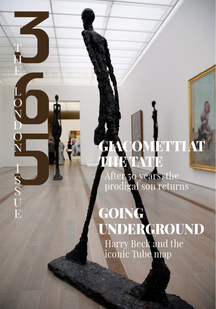
For this magazine project, my goal was to create a clean and visually unified design that felt like a real publication. I wanted to highlight the artistic energy of London while maintaining clear readability across all six pages. I chose the Giacometti theme for the main article because I felt that his artistic style matched well with the architectural depth of my selected cover image. For the ASF page, I used a clean grid layout to showcase the five best album covers of all time, keeping typography minimal to let the visuals speak for themselves.One of the main challenges I faced was making the cover text readable on a busy photo background. I initially tried both white and black text, but neither stood out well enough against the brick wall. I considered using a semi-transparent black box behind the text, but in the end, I decided to go with a bold blue font color, which created a strong contrast while still matching the overall tone of the image. I think this solution balanced visibility and aesthetics in a cleaner way.