Categories
M. Thomason Website

My Website!

Here’s a preview of my Website!

I really enjoyed this project, going into my only goal was to make something because I had never coded before this. Which as you can tell from the fact that I’m making this post I was able to do that. While working on this I had a lot of fun which surprised me. It was challenging, but also not, in that everything you do is intentional and not only was it a design project, but the creation of it was kinda like a puzzle. 

I stuck mainly with green as my main color because I like it. I made the background an oaty color because I thought all white would be too much, but I still incorporated accents of white in the nav bar and the footer (which you can’t see). I was not able to post my website because I was unable to get the VPN to work for me. When choosing the fonts I used I wanted to make sure they went well together while also creating a look that I felt represented my personal design aesthetic. I also wanted to pick fonts that were common enough that they could be on anyone’s device. For the most part how I made most of my design choices was just me messing around with the code and if I liked it or thought it looked cool I kept it. I think having that be the main thing driving my process let me have a lot of fun with this and I felt comfortable trying out things that I didn’t know would work.
Categories
M. Thomason Poster

Strawberry fest Poster

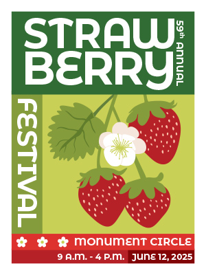
Maddie Thomason's poster
Click here to see the full image!

My Goals for this poster was to go out of my design comfort zone and make something in a style I don’t normally use. Mainly having a sans serif font as the main font used cause I tend to gravitate towards serif fonts. My creative process consisted of a lot of sketching and thinking about what choices I wanted to make and overall how I wanted the vibe/look to be. I looked for inspiration on pinterest and made a board to save any color combinations or posters that I like design elements in. 

I think the colors in my poster are pretty good, I stuck mainly with green and red (because strawberries) and I am happy that it doesn’t read as christmas cause that can easily happen with green and red. I think the illustration of the strawberries also turned out really well. It is still cartoonish while maintaining a good amount of realism. I think the placement and sizes of the text were hard to perfect and deciding how much/little detail to give about the event. In the future when I work on posters I want to work on my illustration and make them more stylized along with more detail.

Categories
M. Thomason Magazine

My Magazine!!

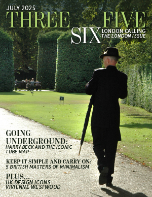
Maddie Thomason's Magazine Cover
Click the image to see my full design!

My main goal that I had going into this project was to make something that I think looks good and is successful in sharing the stories/information and more importantly I wanted to enjoy the process of making it. I had a lot of fun working on this project. There were definitely parts of it that frustrated me. I have also learned that I am fairly indecisive because I went through about 6 different layout ideas for the main story and had to sleep on a lot of different ideas for how I wanted to approach the ASF. I think that I did a good job of meeting both of my goals for this project. Creating and trying out the different layout ideas that I had was a lot of fun and I think by allowing myself to try (and fail) so many times helped make a good final product. 

The first thing that I did was pick out the fonts that I would use for the cover and rest of the magazine. I looked on Pinterest at other magazines and their font and layout choices to inform my decisions and figure out what works and what doesn’t. After I made the cover I used that to guide the typography throughout the rest of the magazine. When it came to adding color I decided to take colors from the main images I use. I did this because I think it helps in incorporating the images and the text together to create a harmonious look between the text and images. 

My creative process consisted a lot of making a design and then putting down my laptop/pencil and thinking about it after thinking it through. I would come back and make changes or try another idea that I may have come up with. Something that was something that took a bit to get used to was the centerfold. I’ve done a lot of yearbook design so being able to have elements so close to the centerfold was very new to me and a mental barrier that took me a while to overcome. At first I struggled to calibrate to the scaling of things on the page I would make something, but then upon looking back it would be too big or small on the page. I think in the future I want to try and incorporate more white space and different ways of placing images into the design.