Categories
I. Wu Poster

Melabee Poster

Isabelle Wu's Poster
Click this image to see my design!

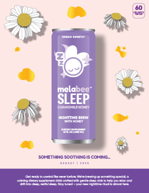
Because we had free reign to make anything for this poster project, I decided to create a product launch poster for my melatonin drink company, Melabee. This is a real product that I am currently working on with a team and we do expect to launch our final product in August so stay tuned!


My goal was to create a calm and dreamy atmosphere using our brand colors and symbolic imagery. The design conveys restfulness as well as anticipation for the launch. Everything was created from scratch, from each chamomile flower to the entire can, mainly using the pen tool and gradient tool to make each element come to life. No tracing or outside images were used, just reference photos of chamomile flowers and our product.

I applied design principles like balance, alignment, and contrast, so the layout guides the eye from top to bottom with clear visual hierarchy. I also used spacing to make sure every word was legible. In terms of typography, I used 3 main fonts that were already on the design of our packaging and applied it to any remaining text on the poster so that everything is cohesive.

As for my creative process, I started with a basic sketch of what my poster would look like before gathering realistic photo references for each graphic element and then drawing from scratch in Illustrator. Looking ahead, my goal is to keep experimenting with Illustrator to become more familiar with each tool, so that next time I open Illustrator to create something, the process is faster because I am more comfortable with the application.

Categories
Magazine

Magazine Project

Isabelle Wu's magazine cover
Click the image to see my full design!

For my final project, I created a magazine spread for THREESIXFIVE: The London Issue, and it ended up being one of the most rewarding design experiences I’ve had. This project helped me understand how editorial design goes beyond just layout, and it’s really about storytelling, pacing, and guiding the reader through both visuals and text in a meaningful way.

One of the biggest things I learned was how to use alternative story forms to break up information and make it more engaging. For example, the album cover feature uses visual hierarchy and icons to let readers scan quickly, which added variety to the overall reading experience. I also gained a lot of insight into how important type choices are. I used bold, expressive fonts for headlines and paired them with clean serif text for readability, especially in the Giacometti feature, which needed to feel both artistic and serious.

Design-wise, I went with a muted, modern color palette inspired by London and museum spaces, to tie the art and cultural themes together. I used full-bleed images for impact and kept a consistent grid throughout to make sure everything felt cohesive. The cover is simple and type-driven, which I felt set the tone well for the rest of the issue.

Overall, this project really pushed me to think like a designer, not just about how things look, but how they function and communicate. It was a great way to apply everything we’ve been learning this semester, and I’m proud of how it all came together.