I was actually really nervous about creating a website at first. I was nervous about the coding aspect of it. However, I ended up really enjoying the process. My goal was to have fun with it and create something cohesive. I really enjoyed getting to pick out fonts and colors to use. I went with colors that matched the color scheme of my Wicked poster. It worked out considering pink and green are two of my favorite colors. Overall, I ended up having tons of fun creating this website.
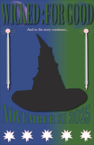
I had a few different goals for this project. Two of the main ones were to create a poster revolved around an interest of mine and to utilize skills that I learned in class. My final product met these goals in a few different ways. I centered my poster around the new Wicked movie coming out and this movie I am extremely interested in. I also utilized skills by using various tools which included the pen, gradient, eye dropper, star, and ellipse tools. I also utilized some text effects. To me the most successful and difficult part of my design were my drawings. I really struggled with the pen tool at first, so these drawings were not easy for me. However, I really enjoy the finished product. In the future, I think I need to work on adding more intricate details to my design.
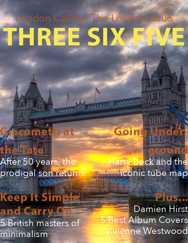
My goals for my publication was to create something that felt cohesive as well as to properly choose text fonts and colors that aligned with the images being used and the stories being told. I wanted to create something that caused me to have to use some of the new skills that I have learned in this class so far. I do feel as though I was successful in completing these goals. I feel like the fonts that I picked were decent choices and they did not seem out of place. Outside of when I used black and white, the colors that I chose to use for the text matched certain colors in the images. I also used a couple of new skills that I learned. When choosing font colors, I used the eyedropper tool on the images. I utilized the rectangle tool on my ASF page and also used the eyedropper tool for the colors of each rectangle. For my spread, I went back to what we learned during our Will Cactus assignment. I used the quick selection tool and then adjusted the hue, saturation, and lightness properties to color everything outside of Alberto Giacometti.
For the cover of the magazine, I wanted it to look more like a touristy magazine. I chose the image that I chose as I feel like it is the type of image you typically see on a tourist/travel magazine. I wanted the font colors to not just be white and black, so I decided to pull colors from the image by using the eyedropper tool. When it came to the spread and I read the word “madness”, I thought it would be neat to utilize a color that I associate with the word “madness”. I originally thought of red, but went with blue as it is another color I associate with the word. I also just simply thought it was a fun way to play around with tools that I learned how to use in Photoshop and thought that the pop of color would stand out more than just the plain image. When it came to the two pages that incorporated the rest of the main story as well as the side bar, I wanted to keep it simple. I just put the text in a normal layout and used Times New Roman for the font. With the side bar, I did try to make it more interesting with the colors. Again, I used the eyedropper tool and used a color from each image in the text box. For the ASF, I once again did a simple layout, but I decided to add lots of color. I think that music is such a fun topic and I think lots of color helps to encapsulate that fun. I utilized the eyedropper tool here as well.
I learned that it is extremely important to be selective and intentional with the images that you choose. I found myself at certain times picking certain images because I liked them more. However, I learned that the image you like the best does not always fit the story or the text the best. During my original design, I was implementing way too many different fonts. I thought it would be fun to incorporate so many that I liked, but I found that it did not work for this specific project. It only made it look messy. This mistake taught me to better understand that it is better to use less when it comes to the number of fonts. I can definitely work to improve on making more interesting layouts. I feel as though most of my layouts are quite simple.