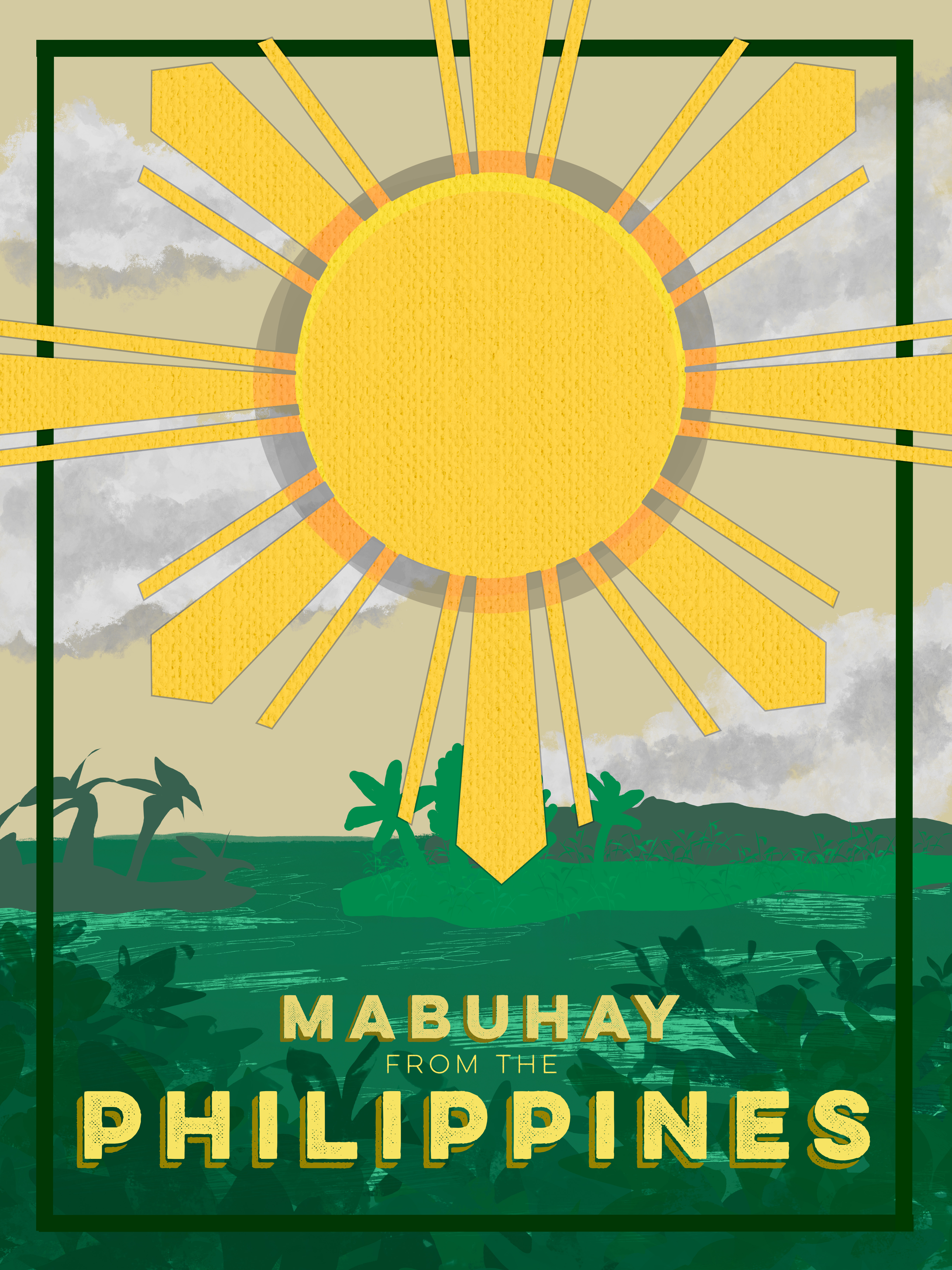
I took my own spin on the project, and I made a poster capturing a country. The event itself is coming to that country to explore and enjoy what it has to offer. The poster design I chose was a poster that I would hang on my wall. It has the Philippine sun on the front with a woven texture to capture the country’s known design of wicker and threaded items. I used greens and light sandy browns to capture the lush greenery found in the Philippines with the typography “Mubhay” which also means “Welcome” in Tagalog, the native language of the Philippines.
I learned a lot from this project, and it took a lot of layers and redesign to get it to where I like it. I am not particularly proud of this poster and wish it could be better, but that’s because I designed it. I tried taking various elements from other Filipino event posters and tying them to my own work and design. I drew a lot of things on the illustration poster and used various brushes to create something that matches the overall theme.