Going into this assignment my main goal was to learn how to better use Illustrator. While I am familiar with the program and have used it for small projects, I have never created something on this scale before. Due to this I wanted to learn more about the different tools that Illustrator has and utilize them to create my design. I especially wanted to fine tune my pen tool skills. As a whole I think that I met those goals within this project. Throughout the unit and my project, I found that I was able to significantly improve my Illustrator skills, including making smooth bezier curves without any unwanted, sharp points. I also found myself becoming far more familiar with the tools in illustrator, utilizing symbol sprayer, color guide, and gaussian blur effects, throughout my design, bringing it to life.
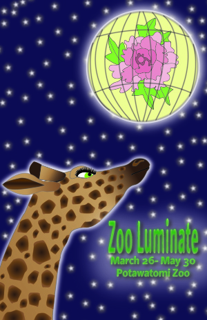
For my poster project I decided to make a poster for an event that recently ended at my local zoo. It was called Zoo Luminate and our entire zoo was decorated with Chinese lanterns in the shape of zoo animals. The lanterns were all really pretty and I instantly thought that this would be a great event to make a poster for. I decided to focus on two different lanterns for the design; a traditional Chinese lantern and a lantern at the event that looked like a giraffe. I chose the giraffe because the giraffe lantern greets visitors at the zoo entrance; the giraffe is also one of the zoo’s main attractions. Since it was a central component to the event and to the zoo as a whole I thought it would be great to include a giraffe in the design. I decided to use the traditional lantern to visually represent the event and had it placed in the sky like it was a moon.
I think the part of my design that was the most successful was the giraffe, though I might be partial to it since it was the component of the poster that took the most time. I spent a lot of time fine tuning the details, trying to give it character while making it look accurate without being too flat. I spent a lot of time drawing each sploch on the giraffe so that they were the right shape and size and adjusting each of the radial gradients to make sure they looked right. However, the giraffe was also one of the most difficult parts of the project because during most of the work it looked too flat compared to the rest of the design. This turned out to be the hardest part; making the whole design cohesive but also alive. Early on in the project I added some gaussian blurs and backlighting on the lantern and the stars to make them look like they were glowing, which created a cool effect and helped make the elements look less flat. I duplicated the text, applied a heavy gaussian blur, and made it a darker color to add texture and color to the text to make it look less flat. These changes made the giraffe look slightly off compared to the other elements . I spent a lot of time trying different things to get it to not look so flat. I tried adding a gaussian blur to the giraffe and some backlighting, which looked good but didn’t fix the problem. I kept changing and modifying the giraffe but it still looked flat. Eventually after a couple of days of sitting with the problem I realized that the giraffe was pretty pale and that the singular color I originally had on the body of the giraffe was the issue. I added a gradient and made the giraffe darker and it just pulled it all together. Looking at the poster now, I think I overcorrected a little bit and made the giraffe too dark, but I still think it looks pretty good.
Overall, I didn’t really have any parts of this project where I felt like I made any big mistakes, which is good. I made a couple of small mistakes with layering, like making a layer over another layer when it needed to be below it. In the future I think I will also be more mindful of when I create a layer from the beginning of my design because I found myself having to create layers or move things from one layer to another while I was in the middle of editing. Besides those issues, I think for my next project I want to spend more time playing with Illustrator and experimenting with different effects and tools. While I feel like I did a good job using the different tools that were in our tutorials, I didn’t spend a lot of time exploring the other things that Illustrator offers, especially when it comes to different textural effects that it has. I think I also want to utilize the path finder tool next time since I didn’t really need to use that in this specific design.