My Goals for this poster was to go out of my design comfort zone and make something in a style I don’t normally use. Mainly having a sans serif font as the main font used cause I tend to gravitate towards serif fonts. My creative process consisted of a lot of sketching and thinking about what choices I wanted to make and overall how I wanted the vibe/look to be. I looked for inspiration on pinterest and made a board to save any color combinations or posters that I like design elements in.
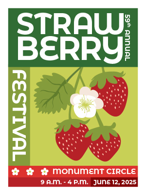
I think the colors in my poster are pretty good, I stuck mainly with green and red (because strawberries) and I am happy that it doesn’t read as christmas cause that can easily happen with green and red. I think the illustration of the strawberries also turned out really well. It is still cartoonish while maintaining a good amount of realism. I think the placement and sizes of the text were hard to perfect and deciding how much/little detail to give about the event. In the future when I work on posters I want to work on my illustration and make them more stylized along with more detail.