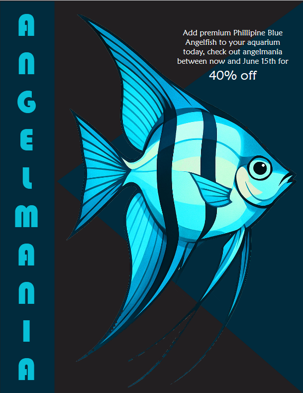
My poster goal was to market the beauty of the Philippine Blue Angelfish and raise awareness to a 40% off deal. This fake event would be on a timely basis showing the limited-time offer marked in a bold and easy to read format. I had an aim that the poster should be modern and minimal and have a good flow.I started by drawing one of my own angelfish in Adobe illustrator, so that the design could be viewed as more personal and real. I focused on leading lines in the fins to assist in guiding the eye on the picture. I colored the drawing using a monochromatic color scheme created by adobe. Then I imported the drawing to Photoshop to clean it up and save it as a PSD file. The reason why I did this was to make the final layout in InDesign,where I concentrated on the type and spacing (I find it the easiest here). Among the deliberate decisions, one was to make the shape of a triangle, which also makes a sort of a directional flow towards the upright title, thus contributing to defining the visual background of the whole composition. I think that the most powerful aspect of the work is that headline, as it identifies the piece immediately. Vertical composition, the shape of a triangle, and directional lines on the fish form a natural flow that the viewer can follow. It renders the design to be harmonious and self-assuredThe greatest difficulty was how far to take on the visual detail without overloading the statement. I was inclined to minimalism, and in the future, I would like to develop and incorporate some sort of soft texture or even some background images to enhance the composition with the layout remaining open. All in all, I am proud of the poster. This project allowed me to develop my skills in combining several tools and programs, such as Illustrator, Photoshop, and InDesign, in a single workflow, and realize that well-thought choices can direct the experience the viewers have.