For this post, I will explain the goals of my poster, explain how successful I feel I was in accomplishing said goal, and give an analysis of my process, determine which areas best displayed my skills, show what was most difficult, and look at where I must improve.
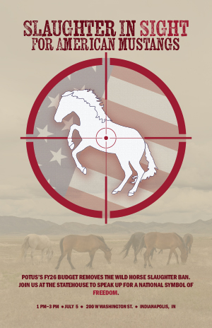
First, I should express the purpose of this poster, as my topic choice is very niche. I chose this topic because I am an advocate of wild horse management and a long-time equestrian. Right now, our president’s Fiscal Year 2026 (FY26) budget aims to not only remove the ban on American mustang slaughter but also decrease the Bureau of Land Management’s (BLM’s) budget by 25%, thus endangering the Wild Horse and Burro Program and the 64,000 wild horses and burros currently being held in captivity after having been captured from their ranges in the Herd Management Areas (HMAs). The budget will also make it easier to sell animals and remove their protected status. Finally, not only may the government “dispose of” the “excess” animals, but it also increases the probability of horses being shipped to Canada and Mexico–where they may be legally slaughtered for pet food or human consumption. Thus, this poster acts as an outlet to the frustration that I, and many other wild horse advocates, feel. My goal was to quickly and efficiently educate the public and welcome them to a public protest, where they may learn more about this issue. Even without reading the smaller text, the headline is a shock that should encourage civilians to do additional research. Because American wild horses/mustangs are generally considered national symbols of freedom and remnants of the American Wild West, I wanted to appeal not only to animal lovers (and draw attention using a horse silhouette), but also to those who care deeply about this nation (by using the flag). We usually associate America with Bald Eagles, but many also remember the wild horses running free in the West–the escaped horses of the Spanish settlers, the “mestengos”. Wild horses are in America’s DNA. My ultimate goal was to inform the public that a symbol of freedom and American history is now under attack, and we must fight back.
With respect to my design goals though, my hope was to create a dynamic, striking poster that was simple yet effective. I tend to overcomplicate everything, and I wanted to focus on a simple concept that still showed how much effort I put in. My goal was to use the rules of design correctly and make a layered, technically difficult illustration that quickly informed readers while pushing my new designing capabilities.
Next, I believe that I was fairly successful in my goals, and I will explain my reasoning behind my claim, as well as explain which aspect was the most difficult and why. First, I used many design techniques/rules in this class, implemented strategies written about in my last post, and remained loyal to the techniques/rules of design that we focused on this semester. Regarding techniques used, I began with a rough design that focused on the Wild Horse and Burro Program logo drawn inside a sight, with an arched headline wrapping around the sight, as well as a dark and light red-striped background and stars surrounding the sight. I moved on to craft another design mimicking James Montgomery Flagg’s “I WANT YOU”/Uncle Sam poster; the sketch had two colors offsetting the poster, navy/beige/red color scheme, sans serif font, and a simple background. However, the designs were all too busy and highlighted the American flag too much. I then tried using a photo of a flag with reduced opacity as my background, but this idea failed because the text was lost in the flag’s pattern. Thus, I improved from the last project and went through variations of my sketches, allowing myself the time to change elements; this choice (to redesign my poster multiple times) and the hours of placing, grouping, clipping, and altering the flag’s components were the most difficult parts. With the time, frustration, and inability to effectively use the flag making me feel like a bad designer, I often considered switching my topic. I moved forward though, intending to make a waving flag later in the process, and hence drew my horse’s body, mane, tail, and hooves with the pen tool and grouped them together; I created my sight by using the ellipse, rectangle, and pen tools. I then drew my flag using the star and rectangle tools and used my shape mode and pathfinder tools to merge my rectangles and join everything into a combined element. After days of figuring out how to incorporate the flag to invoke national pride and urgency towards my plight, I decided to make an opacity mask. I drew an additional ellipse, the same size as my sight and made a mask to use over my flag; once finished with reducing the flag’s opacity and setting my mustang outline in front of it, I set my sight in front of both elements. Before settling on using the mask, I also experimented with my warp, mesh, envelope distort, and lasso tools, as I initially wanted a perfect, waving flag. To further add to the illustrations, I used the texturizer to create a canvas fabric for the flag (with lighting coming from the top-left), and I added a canvas texture to my horse, complete with a small drop shadow to separate my silhouette from the flag (again with the light coming from the top left). Because I could not directly put the BLM’s Wild Horse and Burro Program logo (copyright issues), I made my horse’s silhouette a bit like its own little version of a logo/badge–hence the repeated use of a canvas texture rather than hair/hide. Notably, the textured background is an Adobe stock photo of mustangs, but the opacity is lowered, so a beige rectangle shows through and lessens the vivid colors. Colors were chosen using the Uncle Sam poster and US flag, but because I wanted RGB and CMYK color schemes to translate easily between web images and print design, I altered the colors and made them less vivid; the scheme used beige (background), blue (flag, stroke for the horse, background), and red (lettering, sight, flag). My horse was left white, to represent purity and the flag, while the red represented blood and the flag. The blue tied the flag, background, and horse elements together but had no significant meaning. For lettering, I used Kiln Serif, because although I did not want to use a serif font on my poster, I liked the “blood spatter” look of this font, as well as the “Wanted” poster aesthetic. I used Franklin Gothic Demi Condensed for my smaller type, as it resembled the typography from the Uncle Sam poster. The lettering hopefully also added visual echoes by using the same red hue used in the sight as some of the type. For this project, I also created hierarchy and visual flow, with the large illustration set just above the center of the poster to grab attention; viewers then look up to the smaller headline, and finally back through the illustration and to the bottom of the poster (with the smallest text and information/meeting time). To use the negative space in my textured background, I made the horses run through the blank space. I also think that I created interactions in my design by reducing opacity and setting elements within/below others. Notably, the circular glyphs are supposed to create an additional visual echo. To add dynamic alignment, I set the flag’s stripes at the same diagonal angle as the rearing horse’s back. For another design strategy, I used the golden ratio/section, as the grouped headline and illustration take up 62% of the used space. Finally, I do believe that I achieved my goal, because I used many design strategies and rules, while also spending hours ensuring color would translate better between mediums (which was my issue with the magazine project). Furthermore, I believe that I followed many (though not all) of Müller-Brockmann’s ideas, as my poster is readable, shows simplicity of design, abides by the three-face maximum rule, adds emphasis with a limited color pallet, imparts information quickly, and maintains symmetrical balance (while using a diagonal composition within the illustrated element). I feel that I created a meaningful design while following design rules, and I have improved my skills since the last project.
Moreover, my design had strengths and weaknesses. I believe that the horse illustration showed how much I have improved with the pen tool, and the flag’s design and position in the layers indicates that I now understand how to use design techniques. I am very proud of my illustration, and I used some tricks and strategies that we learned in class. With grouping and editing, I made my flag similarly to how we made the frets of the guitar and used the pathfinder and shape modes. I used the opacity mask similarly to how we used a mask in the handout for the “beans” poster. Yet, I will say that the horse’s right hindquarter was incredibly difficult to draw. The animal in my reference photo was at an angle where the right hind leg was wider and straighter looking than the left one. I tried to fix the issue when I drew the animal with the pen tool, but I still think that the leg was a tad “wonky”, even after redrawing it multiple times. I do think that I captured the odd curvature of the leg though, where the femur, patella, and tibia meet. Of note, with respect to the lettering, I regret my choices. I made sure that my words were the same length as the sight’s diameter, but in doing so, my type was too small for a headline. I also regret trying to use typographic mass. I initially had the “Slaughter in sight” above the sight, with “for American mustangs” below. It looked better, but the text looked too straight when close to the round sight, and after also deciding that arched text would look too whimsical on such a serious poster, I tried using typographic mass and grouped the text. I think that this was implemented poorly, as the text is too small for my headline, and the lines of text are not even in their width. While I liked the design in the moment, looking back, it looks silly. In the future, I want to work more with typography and its mass and use lettering as an art element within the poster.