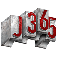
My primary goal for this project was to make my pages readable and visually cohesive while also still being interesting. To do this, I focused on maintaining a monochromatic color profile throughout most of the publication and tried to keep my fonts consistent. I also kept everything in a grid, so it stayed neat and orderly. To grab some visual interest I increased the font size and boldness in the headers. For the cover, I put all the text on the left side to balance out the bus on the right, and I made the “Three Six Five” logo big and bold to be eye catching. I also layered the logo to add some more visual interest. In the last pages of the Giacometti spread, I tried to arrange the images around the text so that when you finish reading the first page, the beginning of the second page isn’t so far off, while also balancing the images so that they look even across the pages. I feel like my goal of keeping things readable and cohesive was pretty well met and I am satisfied with how it turned out. I feel like I could probably have done more to make it more dynamic but I would work on that for the future. Throughout this process, the hardest part was working in an unfamiliar application – and also one that consistently kept crashing my computer. Aside from that, I’m happy with how everything turned out in the end, and I learned a lot from making this.
Categories

