Going into this project, I had three main goals that I wanted to reach. My first goal was to create effective layouts that had a good balance within their designs. I wanted to focus on this because I have not had to make a magazine like this before, so I wanted to use this as an opportunity to get more experience and grow in this area. My second goal was to work on speaking with type in this project, since I haven’t had a lot of opportunity to play with type and use it to express ideas in past projects. Finally, as I worked on the project, I put more of my focus on creating a cohesive design for my magazine. I realized that I was struggling with this as I continued to work on the project, so I created this goal for myself so I would focus on it more.
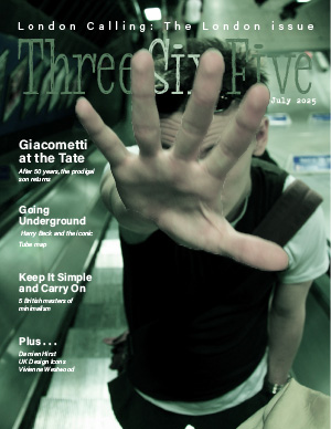
The first design choices I made involved the cover. Going into the magazine I knew that I wanted to focus on the “Five best albums” and the “Going Underground” stories; however, these two story topics don’t really have much in common so I spent a lot of time thinking about what cover image to use. I chose cover-17 because I thought it evoked the feelings of a punk rock musician, due to the way the man was dressed and posed. The image also was set in the Tube so I thought this cover image did a good job of combining the two articles I used. Once I chose my image I made a cutout of the hand to interact with the magazine title to create more visual interest in the image and pulled colors from the image to color the title as well.
My second design choices I made involved the typography I used for the ASF article. I spent some time messing with the typography of the ASF. I thought it would be cool to have the headline be in a square box to look like an album cover, but it was hard to get it to look right since I was using a three column layout on this page. Then I tried taking the typographic elements of the text on each album cover to make the headline. I decided that this was too busy and it took away from the images of album covers themselves, which was the focal point of the story. Instead, I decided to use the same font on the cover for all of my article headlines, to create a cohesiveness between each story. I then used this font to create large numbers next to the albums and made each number a color that came from the album to create visual interest and draw the reader’s eyes.
For “Going Underground”, I spent a lot of time deciding what images I should use for the story. Since the article was about Henry Beck and his map, as well as how Henry Beck is relatively unknown as a designer, I decided I wanted the opening image to be of Beck with “the diagram” to highlight his important role in the design of the Tube map. For the headline type, I decided to line up the word “underground” with the line of the map on the wall, and I made each letter of the word a different color from the different lines on the Tube to add a little color to the image and create an eyecatching headline. I then used the maps of the Tube within the article, placing them at the points of the story where they were specifically mentioned. I figured as a reader, I would finish reading about the map and then want to see it, especially since I am not from London. I also chose to use “Tube Gear” as my side bar, since it correlated with the content of the article better than the side bar about the posters..
When it comes to my creative process, I noticed that I have an easier time coming up with designs for individual articles or singular parts of a magazine, but I have a harder time making a cohesive design across the articles. I think this is because I usually use the articles and the images within them as inspiration for the design, colors, elements, etc. that I use. This meant that as I was working on this project a lot of the elements and colors varied from article to article, so I felt like I had a hard time creating something that felt cohesive across the whole project. As part of this I realized that a lot of the cohesiveness within the magazine comes from typographic consistency across the articles, so I am going to keep this in mind for future projects. I also had a hard time with getting my images sized correctly, especially when I was trying to adjust the resolution. I had to go back and fix some of the images multiple times because they didn’t look right or were too blurry, so this is something I want to continue to work on in the future. Finally, I also learned that when it comes to my design style, I tend to like simpler typographic choices when it comes to fonts. I liked using one font for all of the headlines within the magazine because it felt cleaner and more cohesive and I enjoyed using color, size, and the layout of the text to make each headline unique, despite using the same type.