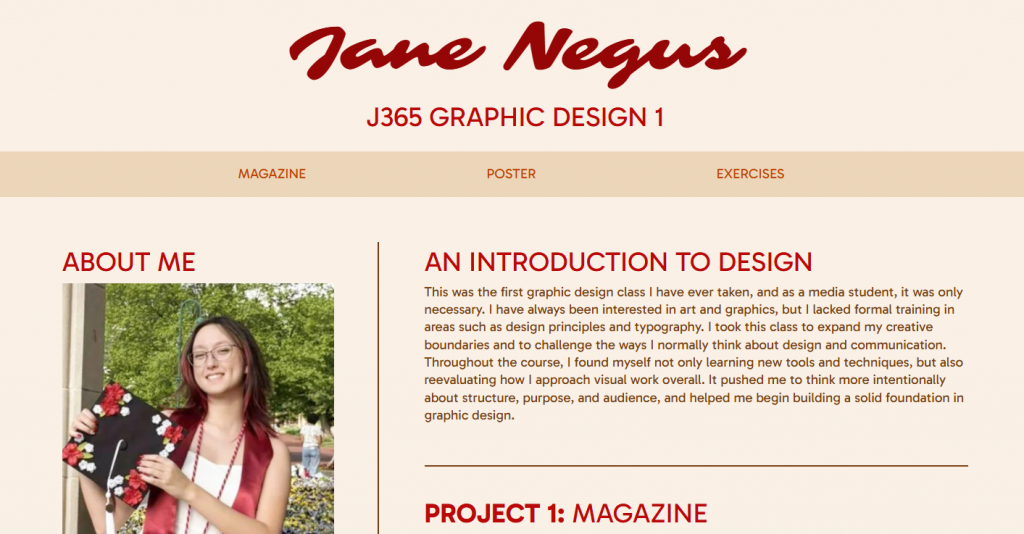
In my opinion, this was probably the most daunting project out of this class. I have experience in coding, but every time I try and do so, I always end up overwhelmed. This time, I allotted myself a plentiful amount of hours to work, so I would be able to take my time and not stress over it. My main focus for building this website was to keep it clean and simple, yet visually appealing. I chose a simple light beige background to be easy on the eyes, and used a brown body text over it. My header text is a more saturated color, meant to pop out. I also made the captions on the images lighter, so they would have less contrast than the rest of the text. Both my navigation bar and my footer are a darker but similar shade of beige, to draw attention and break up the page without being offensively contrasted. The fonts I chose were a calligraphic font for the title, and a friendly-looking sans serif for the headers and body. I chose these fonts because I wanted the page to appear welcoming and warm. I also used the border bars to break up the page a bit more and have clear sections. I made sure that everything on my page has a comfortable but not overwhelming amount of padding or margin. While the page is still a little bit simple, it conveys my purposes well and maintains readability. I am satisfied with the result, especially since it is my first successful webpage creation.
Categories

