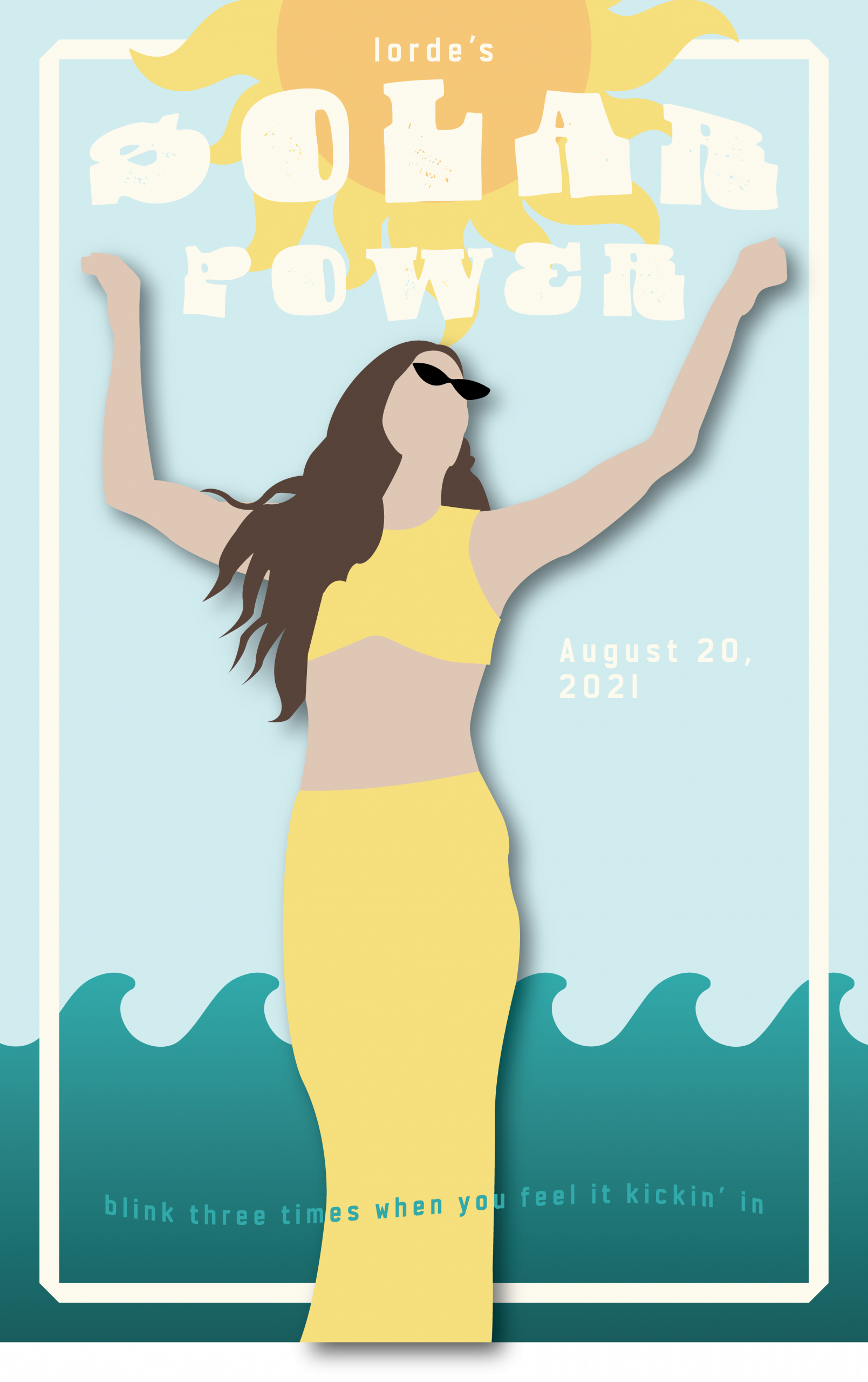
My goal was to create a vibrant, summer-inspired poster that captured the energy and freedom of Lorde’s “Solar Power” album through warm colors, balanced composition, and authentic connection to the music’s themes. I believe the final product was successful in terms of these objectives. The yellow and blue color palette effectively conveys summer vibes, while the central figure with raised arms creates the sense of celebration and liberation I was aiming for. The typography integrates naturally without overwhelming the design.
I started with sketches exploring different compositions before settling on the figure-centered approach. The biggest challenge was achieving the right balance between the text and visual elements. Creating depth in the flat, paper-cut style was also difficult.
The cohesive color story is my strongest achievement. The warm yellows and cool blues work together to create a calming feel, while the layered composition creates unity between all elements.
I need to develop stronger typography skills, particularly in creating more sophisticated hierarchies and text-image integration. This project taught me how color and composition can create emotional impact while balancing artistic vision with clear communication.