My concept for this project was inspired by the movie La La Land, which I recently re-watched. At the end of the movie, one of the main characters, Sebastian, opens up his own jazz club – a lifelong dream of his. The aesthetics and musical themes of the movie make it one of my favorites, so I decided I wanted to create a poster for Sebastian’s jazz club, Seb’s.
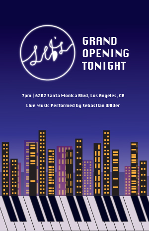
Sebastian plays the piano, and it is the central instrument of the movie. I wanted to incorporate that in my design, as well as the cityscape of Los Angeles, where the movie takes place. Thinking about the shapes of piano keys, I realized I wanted to create a design where the black keys on the piano could form the shadows of the city skyline, integrating both elements within each other. It was challenging at first to figure out how exactly I wanted to execute that vision, though.
What really helped me was creating multiple thumbnail sketches that allowed me to try out different angles and variations. When I first started my blank document, I also went straight to the piano keys first and played around with a few different features to see how they might be able to be warped or manipulated. Establishing the alignment of the keys with the buildings and making the layout aesthetically pleasing was definitely my biggest challenge. I wanted to make sure that my vision came across. That is why I also applied a slight gaussian blur to the black keys of the piano to make them appear more like shadows. I found that also making the piano keys a slight off-white color helped tie the composition together better.
I really enjoyed trying out different variations of shapes and colors with the buildings and windows of the city skyline. I used the shape tools in Illustrator to help, and also layered more buildings in the background with reduced opacity to add depth to the image. I kept the buildings in the foreground black to emphasize the piano’s keys, but added in purples, pinks, and blues in the background to create an analogous color scheme. Overall, I am definitely pleased with how this part turned out.
While the movie has its own logo for Seb’s, I knew that we needed to create our own original designs for this project, so I designed my own variation of the logo using the pen tool. The original logo has a music note for the apostrophe in “Seb’s,” and I wanted to keep that element in some way. So, I added it into the “b,” and created a tail at the top to make the letter reminiscent of an eighth note. I really enjoyed the process of making the logo appear neon, where I copied and pasted-in-place the design multiple times with gradually increasing amounts of gaussian blur. Not only does the logo appear as a neon sign in the movie, but I wanted it to act as a sort of “moon” in my design, providing the light source from which the shadows – the keys – originate from. That is why I also placed it a bit to the left of my design, since the “shadows” veer to the right.
For the rest of the typography, I chose a font that felt both bold and refined to maintain that “Hollywood” feel. I added my headline on the right of the logo to create visual balance, and included the secondary information in smaller text beneath that. I also created a dark gradient for my background to make the text seem even brighter and to represent a darkening night sky.
All in all, I really enjoyed the creative freedom we had with this project, and it was a unique challenge to come up with an original design. Navigating Illustrator has definitely gotten easier because of this project, and despite certain technical or design challenges, they were really rewarding to overcome. I am really happy with the final product.

