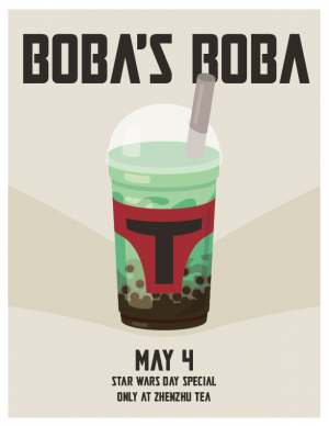
For my design, my goal was to create something simple yet memorable. I had an idea to create a boba tea poster themed after Boba Fett (Disney don’t come for me) – and obviously the date had to be May the 4th. The drink is a matcha bubble tea to simulate the color of Boba Fett’s helmet, with a red label in the shape of the front of it. The gray straw to the side is meant to look like the helmet antenna. I chose to use a neutral color background to allow the drink to pop out better, with a sort of darker “shadow” V shape to point the viewers eyes towards the middle. The font is a font used in the Mandalorian series – another callback to the Star Wars and Boba Fett theme. The font for the drink title is the largest to leave the biggest impression on the viewer, with the date being the second largest, since that is also of importance. One of my biggest difficulties in making this design was making the graphic of the drink, since I am still a little unfamiliar with Illustrator. Creating the cutouts for the tapioca pearls especially gave me a bit of pain. In the end though, I was able to successfully complete what I set out to do and I am satisfied with the result.