My goal was to create a visually engaging and informative magazine that highlights the impact of design history—especially through Harry Beck’s Tube map. I believe the final product achieves this, offering clear storytelling paired with strong visuals.
I used clean, modern fonts for readability and chose a muted color palette to give the magazine a timeless, professional feel. Images—especially of Beck’s map—were central to the layout, helping guide the reader through the narrative visual
This project gave me a deeper understanding of how thoughtful design decisions can enhance storytelling. One of my goals was to create a consistent visual language that tied the magazine together, and while I achieved that in many ways, I also ran into challenges that taught me valuable lessons.
A major success was the intentional use of red and cream tones throughout the magazine. These colors were inspired by the vintage train on the cover and helped establish a retro yet bold aesthetic that connected with the historical focus of the Harry Beck story. Carrying that color scheme across different pages gave the magazine a cohesive tone and subtly reinforced the subject matter without needing to say it outright.
In the map evolution section, I used colored lines that mirrored the actual Tube line colors found in Beck’s diagrams. That design choice wasn’t just decorative—it was meant to echo the visual structure and clarity that made Beck’s map so iconic. It helped visually tie the reader back to the concept of simplification and design efficiency, which was a core theme of the article.
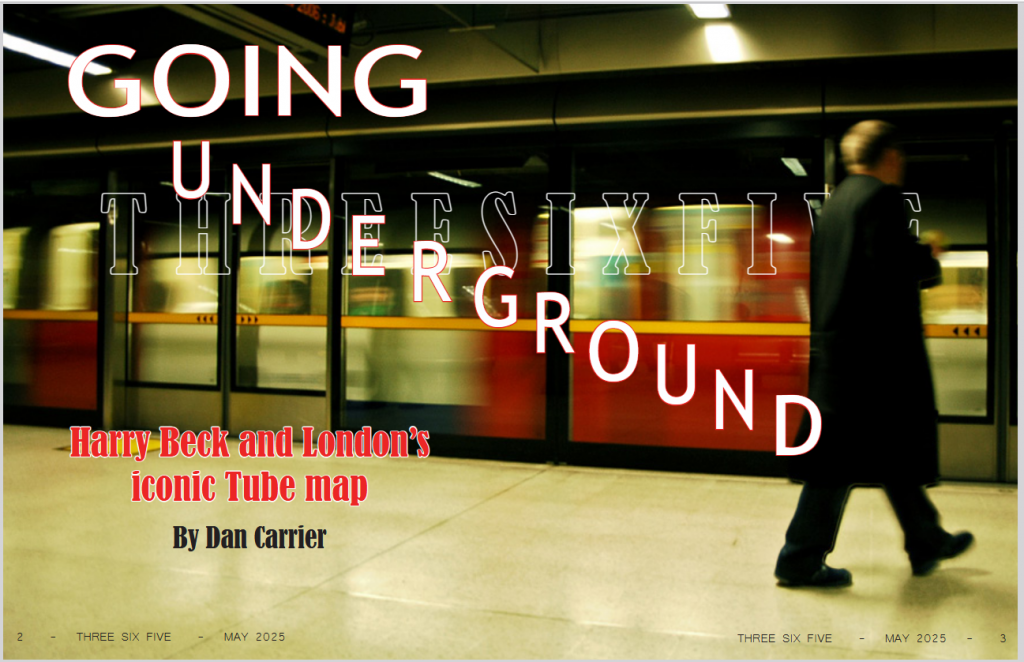
However, not every design decision was successful. I struggled with margin consistency, which made some pages feel slightly off-balance. It’s a small detail that has a big impact on how professional a spread feels, and I now see the importance of double-checking these layout basics. Another area that didn’t meet my expectations was the silhouette of the blurry man on the cover. It was meant to add mystery and atmosphere, but the execution fell short—it looks more like a flaw than a design choice. Next time, I’ll refine my image editing and be more intentional with how effects like blur are used. Not to mention I mistakenly made the cover across an entire spread!
Overall, I learned that subtle details—like color matching, spacing, and visual references—make a big difference in the user experience. I also learned to critique my work more honestly and recognize when something isn’t working visually. In the future, I plan to push my design skills further by exploring more refined layout structures and becoming more detail-oriented with spacing and imagery.