For my final project, I created a magazine spread for THREESIXFIVE: The London Issue, and it ended up being one of the most rewarding design experiences I’ve had. This project helped me understand how editorial design goes beyond just layout, and it’s really about storytelling, pacing, and guiding the reader through both visuals and text in a meaningful way.
One of the biggest things I learned was how to use alternative story forms to break up information and make it more engaging. For example, the album cover feature uses visual hierarchy and icons to let readers scan quickly, which added variety to the overall reading experience. I also gained a lot of insight into how important type choices are. I used bold, expressive fonts for headlines and paired them with clean serif text for readability, especially in the Giacometti feature, which needed to feel both artistic and serious.
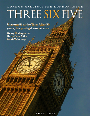
Design-wise, I went with a muted, modern color palette inspired by London and museum spaces, to tie the art and cultural themes together. I used full-bleed images for impact and kept a consistent grid throughout to make sure everything felt cohesive. The cover is simple and type-driven, which I felt set the tone well for the rest of the issue.
Overall, this project really pushed me to think like a designer, not just about how things look, but how they function and communicate. It was a great way to apply everything we’ve been learning this semester, and I’m proud of how it all came together.