My goals for this presentation was to explore with design techniques based on the theme of the story. On my opening spread, I researched how to use the type on a path tool to create a visually stimulating piece that worked with the main image. It was really tricky to figure out, which caused the edges to not be perfect following the semicircle pattern of the tunnel. I felt accomplished since I was able to successfully use the tool in multiple parts of that spread. On my second spread, I wanted the three different train maps to feel like a train map in the process of reading. I created a path and focused on making sure it followed a reasonable path for the readers eyes to follow around the text. I feel like it works well, but the size of the left red line may end up being a bit distracting while reading.
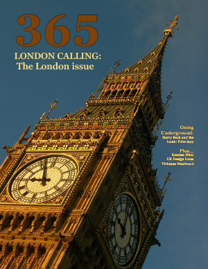
I successfully stuck followed the three face maximum and connected my ASF to my main story with the Chalkduster font. I was especially careful on following my grid in the second spread. I tried to have each element line up perfectly to their grid lines, which made me specifically proud of the top left sign where the underground text perfectly covers the grid. I used the eyedropper tool on my cover and in my spreads to create unity, which I think helps keep a consistent and attractive theme. The grey background for the sidebar is the same color as the railroad in the opening spread image. Considering the story is focused on the development of the tube map, I thought the reader would be most interested in the evolution of the map. I wanted to design a an interesting way to see that evolution and I think it turned out to be very visually interesting.
I learned that it was incredibly helpful to plan ahead. There were a couple ideas I had for the opening spread and cover that would not have ended up successful in practice (at least in the way I tackled it on paper) and I am glad I caught that before I spent the time trying out the design. There were a couple ideas I had to bail on after giving them a crack, but it could’ve been much more. I also learned how to research my own techniques to incorporate into the design. The curved text on my opening spread could’ve been better. The time spent to get it where it ended was more than I expected, and I had to accept that it was not going to be perfect. So I think next time I should experiment with a concept a bit more before committing to it. I also noticed my text is a bit tight and uneven in places, and it may even cause my ASF to appear a bit bland. I like the idea I had, but maybe spending more time tweaking text and adding color to largely white pages could be more appealing.