This post will explain my main goals, key design decisions, and an analysis of my creative process.
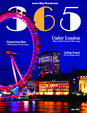
First, I wanted to create a magazine for young designers–a light, alternative, and nuanced set of stories that balanced history with design news and skill advancement/acquisition. Hence, I designed a cover with teasers that: offered a historical perspective of the London Tube map, the best design schools in the United Kingdom, and a review of color theory. This publication was, of course, for young people in the United Kingdom, but I did not want it to feel like a tabloid, which was quite difficult to avoid. The colors, typography, and photos all reflected a slightly “grungy” but still lively aesthetic that prioritized deep thought and critical thinking while holding Millennials’ and Generation Z’s attention. Simply put, this magazine was inspired by the news outlets and magazines that I use daily, but it also had to heavily incorporate and welcome (art) history and artists of all kinds, which are not the topics of most of my favorite sources. My favorite online magazines and news sources are: The New York Times, Forbes, Sentient Media, We Animals, The Guardian, National Geographic, and the BBC Science Focus Magazine; after reviewing their style choices, favorite fonts, and notable teasers, I adjusted my own cover to make it look more professional and show continuity and stylistic flow. I also looked online, specifically using image searches for classic publications like TIME, Vogue, and National Geographic for inspiration as well, both for my spreads and the cover. Thus, while I wanted to establish my own visual identity, I also used outside sources to help create a professional magazine, rather than something like a tabloid or otherwise weak presentation. I do believe that I achieved my goal to create a serious, yet aesthetically pleasing magazine, while focusing on history, design, and the youth.
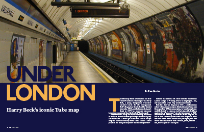
Furthermore, I spent most of my time adjusting my typography, images, and colors. The most difficult part of this project was pairing images and colors, as well as establishing an identity with my fonts. Beginning with typography, I chose to use Broadway, Georgia Pro, and Avenir Next as my three font families, but I used P22 Underground for my headline. I chose Broadway after much contemplation. While Broadway was initially created in 1927 as an Art Deco typeface and usually reminds us of the 20s and 30s, to me, it invoked a feeling of older art forms–dance, music, and drama–that were “wild” for their time. It is a font family of history and innovation of art forms, which deeply resonated with the purposes of my own publication. In addition, I chose to use Georgia Pro, as I read that The New York Times used to use Times New Roman but switched to Georgia; I love The New York Times, and because Adobe InDesign comes with 20 stylistic variations of Georgia Pro, I decided to use Georgia Pro, as it looks a lot like Georgia and has a wide range of styles. Georgia Pro acted as my main Serif font, and I used it in my body text, deck, and author’s name, as well as in my teasers. I chose Avenir Next, as our professor used Avenir in one of our assignments, and I wanted to try it too! However, I only had access to font families such as Avenir Next and Avenir New World. I wanted a Sans Serif for my captions; I also used the Sans Serif in my sidebar and my ASF page, as well as on my cover. I needed a font family that was suitable for my captions but was readable (for the slightly longer paragraphs, like the short paragraph in my sidebar). Next, I used P22 Underground. This font has a story. P22 Underground was created by Paul Hunt in 1997 for the P22 Type Foundry and is an adapted and publicly available version of Johnson, designed by Edward Johnson in 1916 for the Underground Group. Thus, this font was used by the London Underground! I initially used a font family called Omnium, as it was rounded and reminded me of the long tube lights illuminating the insides of buses and along railway passages. However, once I found the font used by the London Underground, I knew that I had to use an adaptation of this font for my opening spread. Moving forward, I must describe my image choices. I chose the image of the London Eye for my cover, because I thought that I could use the “sandwich” effect with it, just as the class did with the Lil Bub cover. I also loved the colors in this cover, and I loved that the colors (blue and orange) were compliments on the color wheel. However, I experienced difficulties with the colors, as CMYK and RGB versions of the photo looked completely different. These issues will be addressed in the next section, but shortly put, my color scheme changed to include yellow-orange and blue-violet. Virtually every photo had to have at least one of these colors, once I made this choice. The image you see in my thumbnail has yellow-orange in it (I used the Eyedropper tool to pull this color from my cover); the text box is a tinted version of one of the two blue-violet colors that I pulled from my cover image (using the Color Theme Tool). Notably, I also used the Golden Ratio and had to crop my image to show the tracks running toward my body text! Thus, my photo took approximately 62% of the space, and it was cropped accordingly, while still abiding by the Rule of Thirds! I continued this pattern and applied the Golden Ratio to the Sidebar on the left side of my second spread and to the main image on the right side of my second spread. The main image (a train) also contained yellow-orange, and I had to swap out the image three times before finding the best one! Images of the maps and of Harry Beck were added to provide historical elements, as I wanted to add visual references within the story, though these elements did not abide by my color scheme (they were thus used as smaller images and did not have as much attention drawn to them). With respect to the sidebar (I chose Poster Parade), I used a tinted version of the one of my color swatches from my cover. I chose to use six images in my sidebar and displayed them chronologically. I did not use all eight posters in the sidebar, as I ran out of room, but I did choose to remove the two posters whose publication/creation dates were duplicates. The posters used also tended to have a blue-violet, blue, orange, or yellow-orange element in them. Lastly, my ASF page was designed to reflect an informative but playful aesthetic. The images were all given strokes from the cover’s color swatch (or using the Eyedropper tool), but I tinted the colors to turn them into pastels and add to the playful effect (I also rounded the edges of each box around the image and around the ASF itself to add to this effect). Thus, this process was long, but the complementary color scheme, three font family rule, and rule of thirds, were carried throughout the magazine, adding continuity of style and consistency of effect. As most of my issues revolved around color, this topic is addressed in the next section.
In this last text block, I will review my mistakes and issues. I had many. First, I struggled with color. The image that I chose for my cover looked very different in Photoshop, and when I added it in InDesign, it changed from an orange and blue color scheme to an orange-yellow and blue-violet scheme. I knew that I had to use the CMYK color model for print projects, but I wanted to preserve the blue and orange complementary color scheme seen in the RBG version of the image. My original plan involved crafting the cover in a separate file and importing the cover as a PNG. Then, I would import the cover without impacting the spreads, and ASF, which would both use CMYK color settings. The final version would use the RBG model for the cover (as a PNG) but still technically be using CMYK colors everywhere else, abiding by the printing rules. However, after doing more research as to how the CMYK and RBG models work, I realized that CMYK model is better for print projects and is a subtractive model, while RBG model uses additive light and needs a screen. Because I wanted to maintain consistency, I used the Transparency Blend Space to change the settings back–from RGB to CMYK. Because of this change, I spent Saturday altering my entire color scheme, swapping images out, and redesigning my headline for my opening spread. The issue came when I went back to Photoshop to create my thumbnail. The file using the CMYK model was dull and unimpressive as a thumbnail, so I used RBG color model settings, just as our video tutorial suggested. However, my project thumbnail looks different from the InDesign file and PDF. Because of this inconsistency, in the poster project, I plan to either use the RBG model (as we used this model when making thumbnails) or only use colors that are “CMYK-safe” (and are less affected by conversions between models). For the former option, I have read that the file should be saved as a transparent PNG for printing, as the printer uses RIP for CMYK color conversion. For the latter option, it seems that some colors are better preserved during conversion than others, as the available colors are more limited in CMYK than RGB color models. I have learned much. Because I am new to this type of project, I assumed that my only option was to use CMYK color settings to maintain consistency, but I now see that I just need to do a little bit more research, as the answer to my problems are not black and white, and I can alter my settings to fit my needs. I have a better plan to illustrate my poster now! Lastly, I learned so much from this project. I learned how tedious this process is. I learned that I must create a contingency plan. I learned that I must take the process in stride; as soon as Week Two began, I started working on the first project instead of waiting. Yet, I had not acquired a full skill set to tackle the project, so I had to redo a lot of my work later on, resulting in over 30 hours of work being needed. As I saw issues with typography, looked at other magazine spreads and covers, perused past students’ work, and designed my magazine’s first six pages, I found out that I needed to work more slowly. I had to work and revise, instead of race forward. I also learned that I needed to accept that a first draft might not be good enough. I became so attached to my work that I was hesitant to change the color scheme from orange and blue to yellow-orange and blue-violet and to move from the Omnium to P22 Underground font family. I was afraid to alter my work. In the next project, I intend to embrace the struggle, work fewer hours, and make rough drafts. I will embrace the tedious process of sketching and resketching, and I will look to work slowly, as the tutorials are given, instead of working too far ahead, before I am ready. I am so excited for the next project, as I become a better artist and designer!