Categories
E. Shannon Website

Diving into Design

Emily's web page!
Click here to see my website!

In this last week, the class learned about HTML and CSS and used those lessons, as well as a structured tutorial, to build a website. I will use this post to explain what I wanted my webpage to look like, what I did to make it unique, and where I must improve.

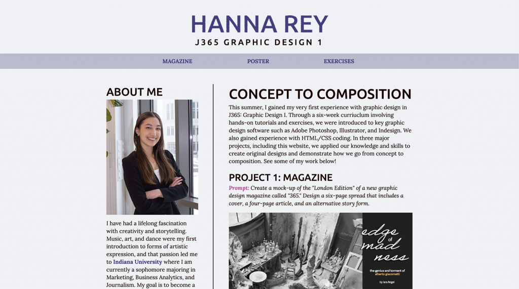
First, it was my goal to create a web page that created an analogous color palette and highlighted my favorite projects, while also showing a few design skills that I learned that went past the tutorial. One of my largest challenges since starting college was to try to understand code. When I looked at the handout and the submission page and saw that were expected to add our own creative elements, my world stopped for a moment, and panic set in. Thus, I set out to follow the tutorials closely, but make minor changes as I went, and then add a personalized flair at the end, once the rest of my code was set in place. I chose a green, blue-green, and blue color scheme, and I then deepened or lightened the colors whenever needed. For our typography, I tried around 15 fonts before settling on Crimson Text for my serif font, and Fahkwang as my sans serif. I loved the simple, clean look of the Crimson Text, and the blue-green background against the deep navy type reminded me of nature and herbs. The sans serif had the wonderful contrast to the evenness of the serif font, and some of the lines that made up the letters were wider or thinner than others. I loved this look. The header was one of the most difficult pieces to create, as it kept being cut off when I added it as a background image. After spending a few hours tweaking the size, the rendering, and the color, I had to fight with my code to force it into the position I wanted and leave a large enough margin. I chose my photo because I have very few photos of myself, but I dislike this one, as I think that it looks a tad blurry on the page. Thankfully, the photo had hues that I could use for my color scheme though.

To make my site more unique, I made smaller changes while watching the tutorials and later added a list, an extra link, and color variations, and 3D header. Because I was not familiar with coding or using code to design, I tried to follow the tutorials and make minor adjustments as I felt more confident. The final stage was adjusting my aside and creating a bulleted list, smaller image, and multiple links. Because I wanted to practice using IDs, creating long links, and adding lists, I used the aside as an opportunity to make my site a bit different from our professor’s. Yet, I struggled to create an aside that looked aesthetically-pleasing, because the addition of the unordered list meant that my “sticky” text only allowed a certain number of words to be viewed; my list became trapped by the “sticky” type. I finally resized my image to fix the issue, but then I began wondering if the photo should align with the “About Me” sitting above it, and I wasted hours trying centered alignment, justified alignment, and changes in photo size. If I could change anything, I would likely find a way to use a larger photo while still having a longer aside and “sticky” type. In addition, in the future, I want to experiment more with the space. I think that my webpage is nice, but I wish that it looked more interesting, and less like our professor’s. My only defense to my lack of additional creativity was my fear of somehow ruining my code and having to start over.

Categories
AJ Porter Website

Project 3: Website

This one was a bit rough. I ended up rushing it more than I even did the poster, which isn’t the best for something like this.

I had a few issues following the template as well. There were a few bugs I could not figure out. I had an issue or two with the padding and margins in between my main text and the side bar., so I decided to take this in stride and design the sidebar a bit differently. The spacing between elements in my main text is way too large as well and I couldn’t quite figure out how to tweak it. My solutions did not tend to work. I fixed a few other issues I had by centering all of the text.

I went with something a bit quirky and contrastive for my color scheme. Again, I see a few ways I could have perfected the idea. The color scheme started because I was inspired by the slate-like colors I had by the end of the week’s main exercise.

I rounded the borders on a few elements as a way of adding some extra personality. It looks a bit silly on the navigation bar, but I quite like how it looks on the sidebar.

Categories
H. Rey Website

My Website

web page screenshot
Please click on the image to go to the full published website!

Out of the three projects, I definitely felt most nervous to begin this one because I had little to no experience with HTML or CSS coding. I was surprised that I actually found it to be a very fun experience. Coding always seems daunting at first, but once you gain a deeper understanding of the language, it becomes an exciting challenge to try and decipher it.

Where I struggled most with this project was getting used to the overall structure of the language for HTML and CSS. I had to use conscious effort to make sure I was focusing on individual parts as their own pieces to the puzzle instead of becoming overwhelmed by looking at the entire coding script. That was especially important when I encountered errors and had to find what exactly had gone wrong. That being said, it was also extremely satisfying when the coding worked and it produced the desired result. I have a long way to go in becoming proficient at this skill, but going through this project just motivated me further to continue working on my progress in the future.

Overall, I appreciated that this project didn’t just allow us to apply a new skill, but also gave us a chance to reflect on all the work we’ve done over the past six weeks. I feel like I have learned so much over such a short period of time and I am excited to use this momentum to keep learning from here.

Categories
J. Negus

My Website

Jane's website
Click to view a pdf of my website!

In my opinion, this was probably the most daunting project out of this class. I have experience in coding, but every time I try and do so, I always end up overwhelmed. This time, I allotted myself a plentiful amount of hours to work, so I would be able to take my time and not stress over it. My main focus for building this website was to keep it clean and simple, yet visually appealing. I chose a simple light beige background to be easy on the eyes, and used a brown body text over it. My header text is a more saturated color, meant to pop out. I also made the captions on the images lighter, so they would have less contrast than the rest of the text. Both my navigation bar and my footer are a darker but similar shade of beige, to draw attention and break up the page without being offensively contrasted. The fonts I chose were a calligraphic font for the title, and a friendly-looking sans serif for the headers and body. I chose these fonts because I wanted the page to appear welcoming and warm. I also used the border bars to break up the page a bit more and have clear sections. I made sure that everything on my page has a comfortable but not overwhelming amount of padding or margin. While the page is still a little bit simple, it conveys my purposes well and maintains readability. I am satisfied with the result, especially since it is my first successful webpage creation.

Categories
V. Gianesi Website

My Website

Valentina's website.

Going into this project I only had one goal: to learn how to code a website and memorize what the different tags and commands mean. Overall, I think that I accomplished this goal and that I was able to code a website that effectively summarizes my work over the course of the semester. I now have many of the tags memorized and understand how to use them to create the effects I want while coding.

When it comes to the design of my website, I can’t really say much about my design choices since I mostly followed the videos. I picked a portrait of myself at marching band because I thought it showed a bit of my personality and some of the other things I do besides class work. For the colors of my website, I mostly pulled colors from my portrait image, altering each one slightly by making them lighter in order to make the whole color scheme more readable. I also decided to do design a header element in Illustrator to help make a statement and made it the dark burgundy red from my color scheme. I’ll admit I’m not fully satisfied with this component though, because it did create some extra empty space that makes it rather unbalanced, so this is something I would try and alter in the future. Finally, I decided to widen the layout so there wasn’t so much extra blank space on the sides.

Over the course of developing my website I didn’t have many issues, as I utilized the instructional videos for this project. My biggest issue came from trying to add or change things in the code that weren’t included in the instructional videos. Sometimes, the changes were easy as I just needed to use a command that we had already learned or used somewhere else. In other cases, such as keeping my header image from repeating, I had to look up online how to code the effect I wanted. Luckily though, the internet had most of the answers I needed and I was able to figure out how to make my website the way I wanted to.

In the future, when coding I want to spend some more time learning how to use sections, divs, ids, and classes, because that was something that I had trouble understanding while developing my magazine. Even though I was able to get the effects I wanted because I watched the videos I didn’t truly understand the concepts I was using. Due to this, I want to spend some more time utilizing those commands and effects in the future when I code so I can better understand what they do for a website.

Categories
C. Liu Website

My Website

This is my website. This site summarizes the magazines and posters I’ve done, as well as some of the exercises. This class has taught me a lot of useful knowledge and I feel happy that it has given me some more skills and I enjoyed taking the class. I hope you all have a wonderful vacation!

Categories
C. Schuler Website

Website

This was a lot of fun to make. It gave me a chance to show off some of the work I dine while gaining knowledge in web design. I wanted to keep the background colors softer for a more welcoming vibe when people visit so I settled on a sandy color scheme for the background. The only thing I wish was that my 3D headliner worked properly so I could show that but other than that, I think it turned out well for how awful of a coder I usually am. I hope to keep this web page handy for my future career as this would be a good spot to upload work for a portfolio.

Categories
G. Vitz Website

My Website

My website
Here is a preview of my site

This project was a good recap for everything we’ve accomplished this summer. It was pretty smooth to complete with the tutorials and easy to make changes to our taste. I hope everyone enjoys the rest of their summer!

Categories
E. Mattingly Website

My Website

Emily Mattingly's Website
This is the top of my website!

I was actually really nervous about creating a website at first. I was nervous about the coding aspect of it. However, I ended up really enjoying the process. My goal was to have fun with it and create something cohesive. I really enjoyed getting to pick out fonts and colors to use. I went with colors that matched the color scheme of my Wicked poster. It worked out considering pink and green are two of my favorite colors. Overall, I ended up having tons of fun creating this website.

Categories
K. Brock Website

My Website

Js65 Website

Here is my website! There were some challenges, but overall I am happy with the turnout!